How to draw a function graph on Excel extremely simply and quickly
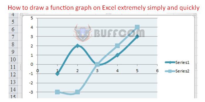
How to draw a function graph on Excel: Back when you were in school, you probably got used to different types of function graphs such as linear, quadratic, cubic, etc., and then how to draw each function using various types of graphs. You would realize that drawing these graphs could be complicated with many steps. Luckily, Excel now supports drawing function graphs with only very fast, accurate and easy-to-see steps. For more details on how to draw function graphs, please refer to the following article.
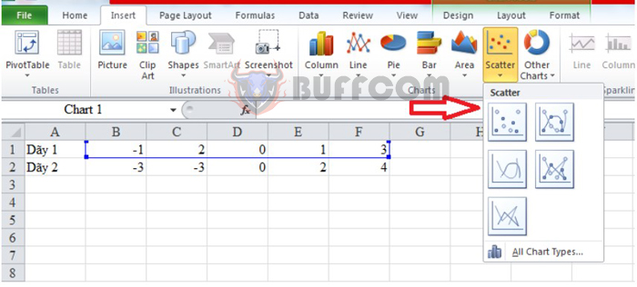
Step 1: Select the type of function graph
First, enter 2 number sequences for the equation. Then, highlight the first number sequence and select Insert, then click on the Scatter icon on the toolbar. Then choose the graph you want.
How to draw a function graph on Excel extremely simply and quickly
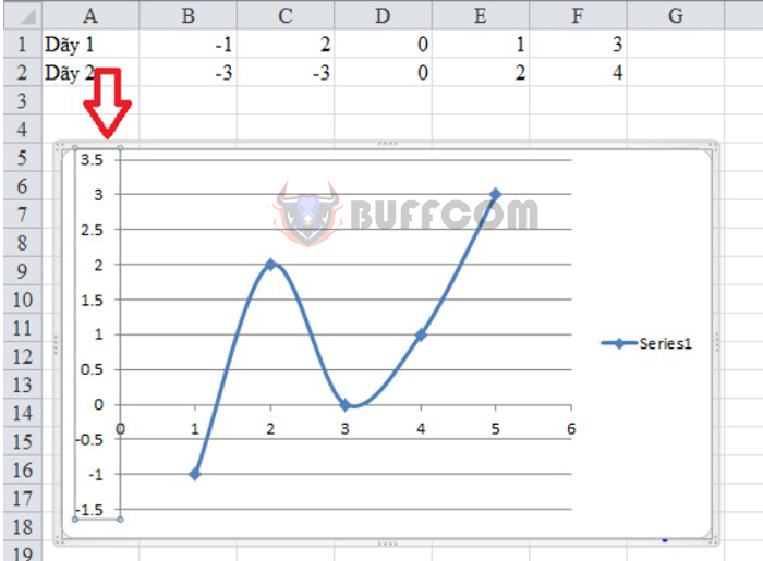
Step 2: Enter the smallest and largest values for the graph
Next, double-click the number sequence on the left side of the graph. This will help you change the values in the graph.
How to draw a function graph on Excel extremely simply and quickly
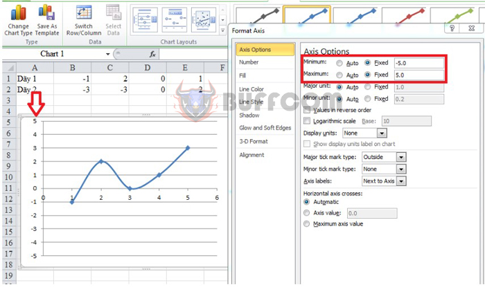
We adjust the values of the graph. The min and max value input will depend on the smallest and largest values of sequence 1 and sequence 2. In the Axis Options section, you can adjust the smallest value to be -5.0 and the largest value to be 5.0. And then, the value of the number sequence will change as shown below:
How to draw a function graph on Excel extremely simply and quickly
Step 3: Add other values to the graph
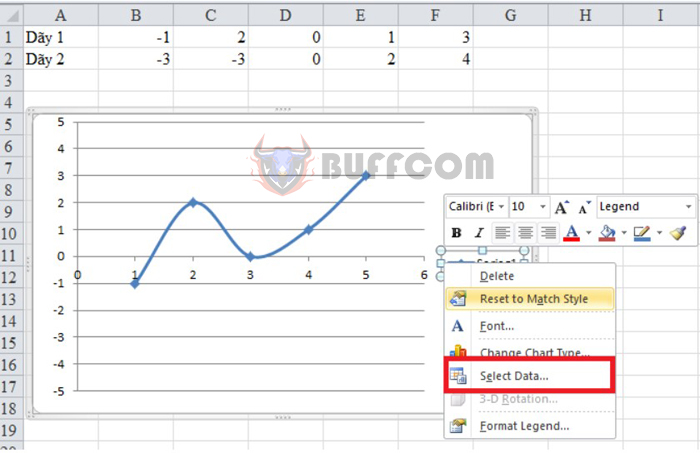
At the function graph, right-click and select Select Data.
How to draw a function graph on Excel extremely simply and quickly
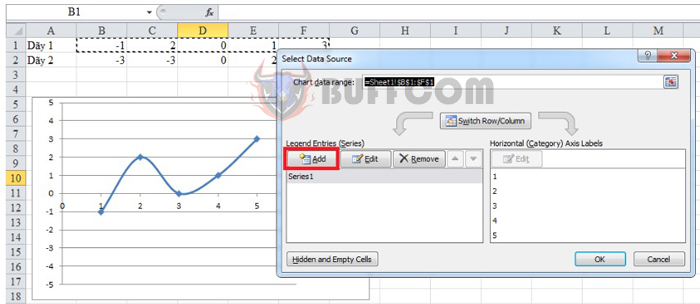
In the Select Data Source interface, click on Add to add values to the graph. This will allow you to add different values to the graph quickly.
How to draw a function graph on Excel extremely simply and quickly
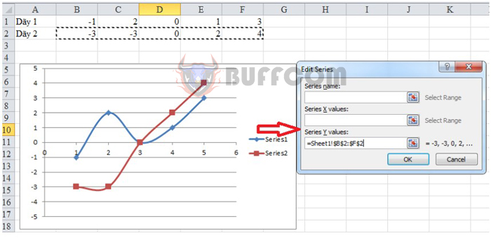
In the new interface, at Series Y values, use the mouse to highlight the second number sequence in the table above. This operation helps you enter values for sequence Y. Then click OK to add the values.
Then, we get a function graph like the following picture:
How to draw a function graph on Excel extremely simply and quickly
Step 4: Change the display style and color for the graph
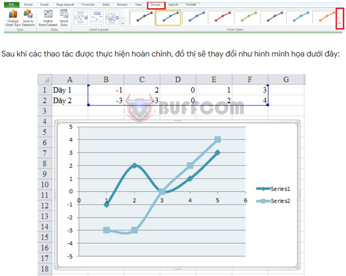
In case you want to change the display style and color of the graph, select Design on the toolbar. Here, you can choose the graph styles you want to use.
How to draw a function graph on Excel extremely simply and quickly
After the steps are completed, the graph will change as illustrated below:
In conclusion, drawing a function graph on Excel is a quick and easy task that can be done in just a few steps. By following the steps outlined in this article, you can create accurate and visually appealing function graphs for your presentations or reports. With the ability to adjust values, add data, and change display styles, Excel offers a flexible and efficient way to create function graphs that meet your specific needs. Give it a try and see for yourself how easy it can be to create professional-looking function graphs on Excel.


