6 Points To Pay Attention to Eliminate Dashboard Clutter

A well-presented dashboard is crucial in conveying information to your audience. One of the most important things to pay attention to is eliminating the clutter of the dashboard and distracting elements. Therefore, remove any elements to make your chart simple yet still fully represent the information. Let’s learn about it with Buffcom.net now!
Eliminate Dashboard Clutter Due to Chart Borders
If you know the Gestalt principle, people tend to see a set of individual elements as a single shape. Therefore, if you remove the borders, people will use whitespace to distinguish the elements on the dashboard interface. This eliminates the clutter of the dashboard and ensures that the information conveyed is not distorted.
 Eliminate Dashboard Clutter Due to Gridlines
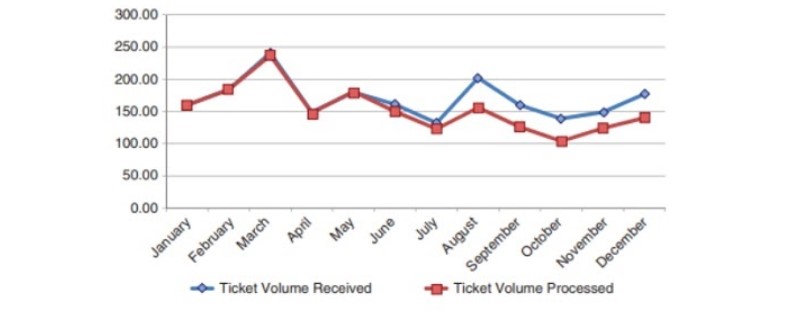
If you want to keep the gridlines to easily identify specific data, only use thin and light-colored gridlines. Do not let the gridlines compete directly with the graph (especially line charts). Removing unnecessary gridlines will make the graph simpler, and the graph data will be more prominent.
 Remove Data Point Markers
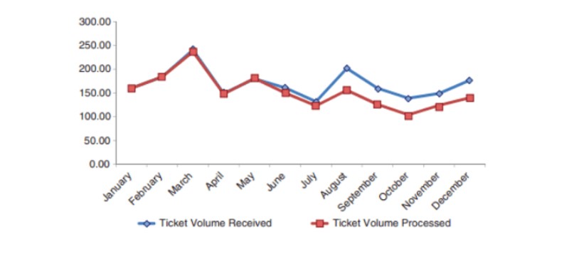
In the case of using a line chart, the turning points between sections of the graph are also data point markers. If these points are clearly visible and distinguishable by the naked eye, you can remove the markers with dots, squares, etc. This will make the graph simpler and easier to read.
You should only use data markers with purpose.
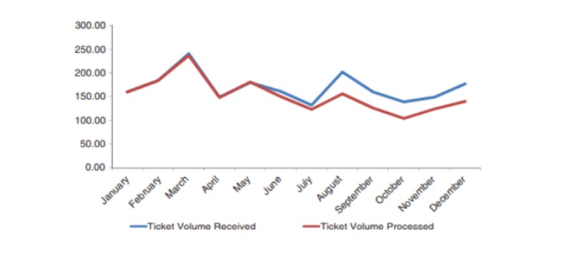 Sort and Simplify Axis Labels
Axis labels can be a cluttering factor on a data dashboard. Maximize the reduction of data placed on the axis labels. For example, remove trailing zeros after commas on the vertical axis labels, abbreviate dates on the horizontal axis labels. This simplifies the dashboard and eliminates clutter.
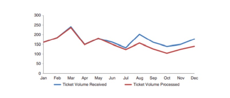 Directly Label Data
Sometimes, excessive use of color coding outside the chart can be necessary. You can apply the Gestalt principle of proximity and name the data directly next to the data it describes. This makes your dashboard simpler and eliminates clutter.
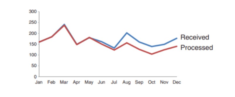 Eliminate Dashboard Clutter from Color
You can synchronize colors between the graph and data. Reducing the number of colors used on the dashboard will make it easier for the reader’s eyes. This eliminates clutter on the dashboard.
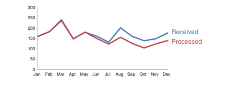 To create an attractive dashboard is not difficult, you just need to pay attention to removing cluttering elements from the charts. Cluttered images create too much information that needs to be perceived. This can hinder the transmission of our message.
Additionally, if your work is closely related to Excel but the software does not meet your needs, please contact Buffcom.net for support!

