Creating Charts with Floating Up and Down Bars in Excel

In this tutorial, we will learn how to create charts with floating up and down bars in Excel.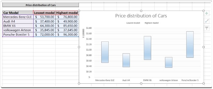
Scenario: When working with charts, we often want to represent data ranges as bars. This can be done by using bar charts or by adding up/down bars to the chart. While bar charts stack data in horizontal bars, changing the orientation of the axis allows us to view the data range in vertical bars. In this tutorial, we will focus on creating a chart with up/down bars. Let’s learn how to solve this problem using any chart type in Excel.
Creating Charts with Floating Up and Down Bars in Excel
How to solve the problem? To achieve this, we will use an attribute of Excel charts called Up/Down bars. This option allows us to display the data range as floating up and down bars in the chart. Floating bars are a great way to compare data ranges within a single chart. Let’s explore how to create an Excel chart with floating bars through the following example and explanation.
Example: To better understand the concept of charts and explore their features, let’s consider an example. We will start by creating a chart and then edit it to represent the data as bars.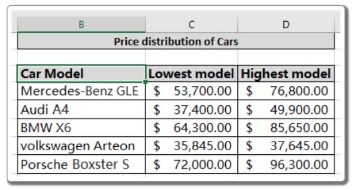
We have data representing the price distribution of cars, which we want to compare with each other. Follow the step-by-step instructions below to create the chart:
- Select the data and choose the desired chart type that best represents the data. In this example, we use a line graph with orange and blue lines. The blue line represents the price of the lowest model, while the orange line represents the price of the highest model.
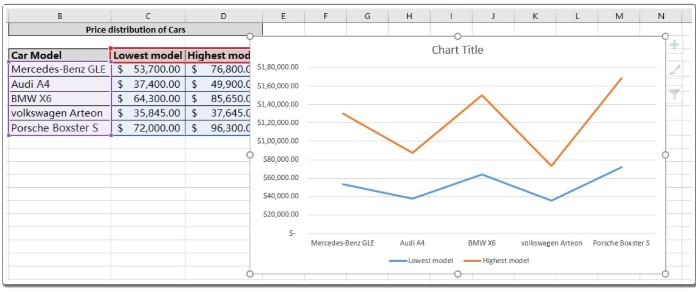
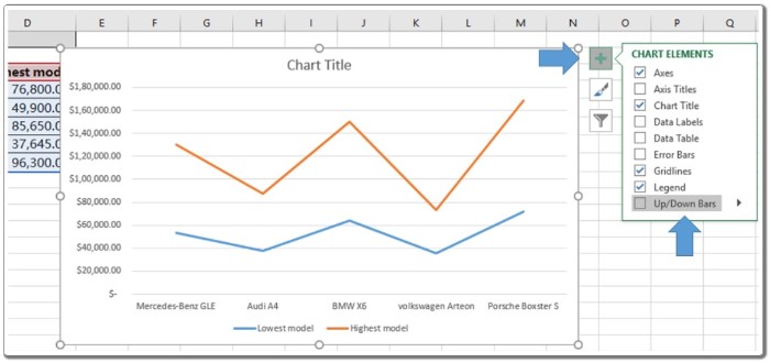
- Look for the plus sign (+) located at the top right of the chart. Click on the plus sign to reveal a drop-down list with additional options.
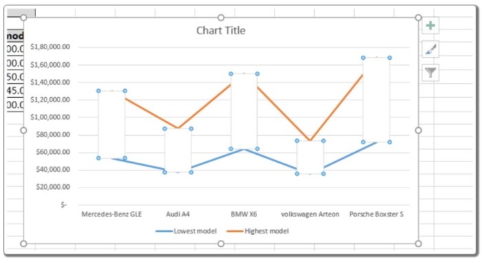
- Select the “Up/Down bars” option from the drop-down list. This feature will display the data range as bars, as shown below the chart.
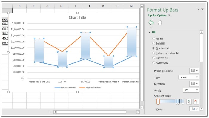
- The chart may require some finishing touches. To fill the bars with color, double-click on the bars, as illustrated in the above image. A “Format Up bars” panel will appear on the right side of the sheet.
- Customize the appearance of the up bars by applying different textures or colors from the “Format Up bars” panel.
- If desired, edit the lines in the chart. Double-click on the orange line and select the “No line” option from the “Format Data Series” panel.
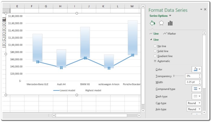
- Repeat the same step for the other line, if necessary. Double-click on the blue line and select the “No line” option from the “Format Data Series” panel.
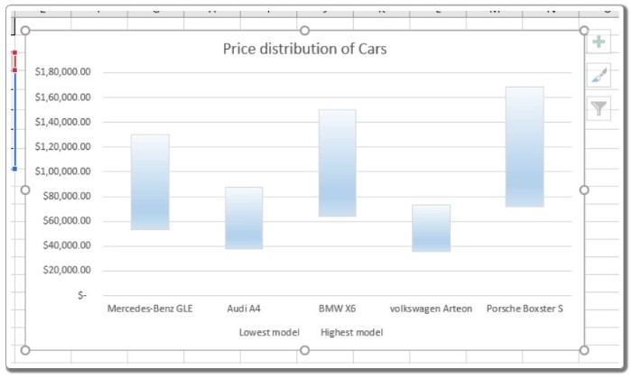
- Add a chart title if it hasn’t been added already. Give your chart a name, and your chart with floating up and down bars is ready.
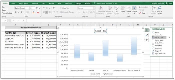
This is an example of a chart with floating up and down bars, representing the price range for different car models. Customize your chart by applying different texture bars, fill colors, editing background settings, and more.