Design Tips for PowerPoint

In today’s business world, PowerPoint presentations are essential tools for effectively communicating information and ideas. A well-designed presentation not only helps you convey your message clearly and engagingly but also leaves a strong impression on your audience. Here are some crucial tips to design PowerPoint slides that will enhance your communication.
Make it Clear
- Concise Visuals: Visuals should be simple and relevant.
- Logical Sequence: Arrange visuals in a logical sequence that follows your presentation structure.
- One Message per Slide: Each visual should convey a specific idea, point, or topic area.
- Limit Text: Don’t reproduce your entire presentation script. Use main points and key words. Edit out unnecessary words until each statement is as concise as possible.
- Check Spelling and Grammar: Ensure all text is free from errors.
- Slide Quantity: Limit the number of slides to 5 or 6 per 10 minutes.

Make it Big
- Readable Visuals: Ensure visuals can be seen from the back of the room.
- Large Font Size: Use a font size of at least 24 points.
- Simple Fonts: Avoid elaborate typefaces. Choose fonts like Helvetica, Arial, or Times.
- Avoid All Capitals: Blocks of text in all capitals are hard to read.
- Clear Captions: Make sure captions on pictures or graphs are visible from the back of the room.
Keep it Simple
- Simplicity: Eliminate unnecessary information and clutter.
- White Space: Don’t cram too much on each slide. Ask if each addition is necessary and what it adds to the message.
- Avoid Busy Backgrounds: Backgrounds should not make text hard to read.
Don’t Go Overboard with Technology
- Focus on Communication: Use animations sparingly. Effects like flying or flashing text can distract your audience.
- Selective Use of Multimedia: Only include sound and video if they are the best way to convey particular information.
- Avoid Sound Effects: Sound effects that accompany animations are best avoided.

Be Consistent
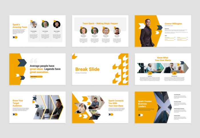
- Unified Look: Choose a general ‘look’ for your presentation and stick to it.
- Consistent Design: Maintain consistency in fonts, colors, and styles throughout your slideshow.
- Visual Flow: Consistency helps link your slides and maintain the flow of your presentation.
Be Visual
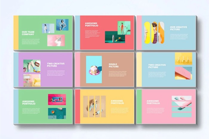
- Effective Use of Color: Increase the impact of visuals with color, but ensure clear contrast between text and background.
- Highlight Key Words: Use a highlight color to emphasize key words.
- Color Harmony: Avoid using too many colors on one slide. Use colors that harmonize rather than clash.
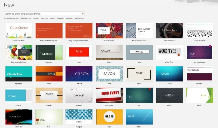
- Color Schemes: Utilize the color schemes available in PowerPoint if unsure about color combinations.
Move Beyond Bullet Points
- Visual Data Representation: Convert data to visual information where possible. Use pictures, graphs, or charts to convey information more effectively than text.

Design Tips for PowerPoint
Use Graphics Well
- Supportive Graphics: Choose graphics that support your presentation, not just for decoration.
- Limit Images: Use 1-2 images per slide.
- Clear Images: Ensure pictures are clear and in focus.
- Readable Tables and Graphs: Keep tables and graphs simple and readable from the back of the room.
- Projection Considerations: Remember that what looks clear on your computer screen may appear paler and less focused when projected onto a large screen.


