Office document formatting tips

Formatting office documents is an essential skill in today’s business environment. Whether you’re creating a report, proposal, or presentation, well-formatted documents can enhance readability and professionalism. Here are some expert tips to ensure your office documents are polished and effective.
1. Choose the Right Font
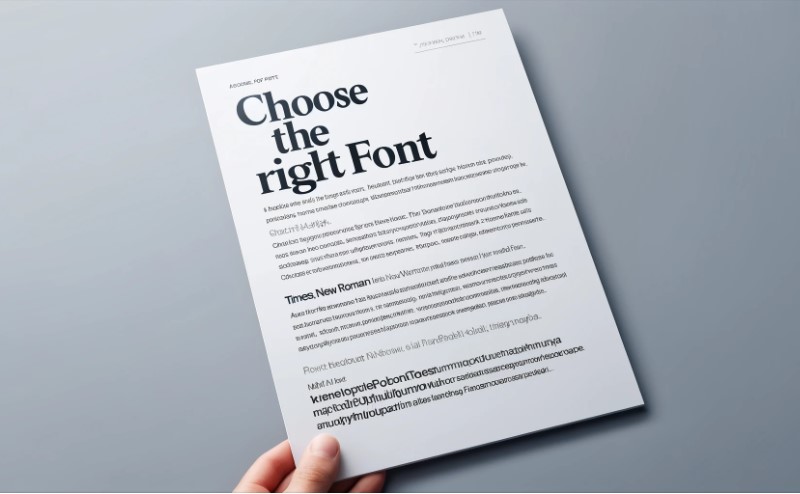
Selecting an appropriate font is the first step in document formatting. Fonts like Times New Roman, Arial, and Calibri are standard choices for their readability and professional appearance. Ensure your font size is between 10 and 12 points for body text, and slightly larger for headings.
 2. Use Consistent Styles
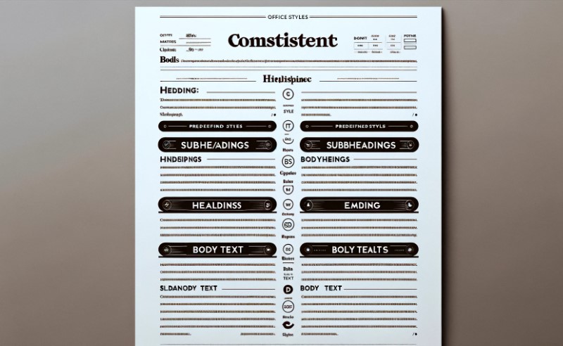
Consistency is key in document formatting. Use styles to ensure uniformity in headings, subheadings, and body text. Most office software provides predefined styles that you can customize to fit your needs.
 3. Utilize Headings and Subheadings
Break your content into sections with headings and subheadings. This not only improves readability but also helps in organizing your document logically. Headings should stand out from the body text, typically by using a larger font size or bold formatting.
 4. Apply Proper Line Spacing
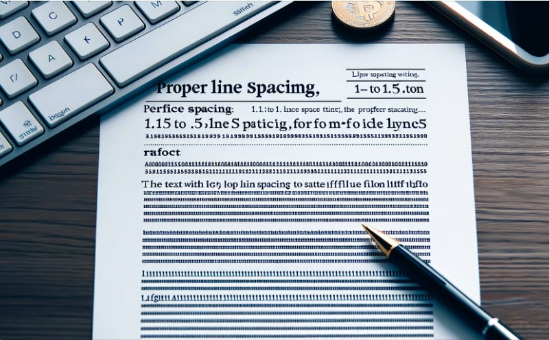
Line spacing affects the readability of your document. Use 1.15 to 1.5 line spacing for body text to ensure your document is easy to read. For academic papers or formal reports, double spacing may be required.
 5. Implement Bullet Points and Numbered Lists
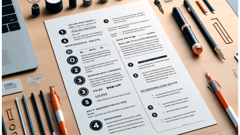
Bullet points and numbered lists are great for highlighting key points and steps. They make the content easier to scan and understand. Use them sparingly to avoid cluttering your document.
 6. Include Margins and Indents
Margins and indents add white space around your text, making your document look clean and organized. Standard margin sizes are one inch on all sides. Indent the first line of each paragraph to differentiate between paragraphs clearly.
7. Insert Page Numbers and Headers/Footers
Adding page numbers and headers or footers is essential for longer documents. Page numbers help readers navigate your document, while headers and footers can include important information like the document title, author’s name, and date.
 8. Use Tables and Charts
Tables and charts are excellent for presenting data and information clearly. Ensure they are labeled correctly and formatted consistently with the rest of your document. Use contrasting colors to differentiate data points.
9. Incorporate Visual Elements
Visual elements like images, graphs, and icons can make your document more engaging. Ensure these elements are high quality and relevant to the content. Align them properly with the text to maintain a clean layout.
10. Proofread and Edit
Finally, always proofread and edit your document. Check for spelling and grammar errors, and ensure that the formatting is consistent throughout. It’s helpful to have a colleague review your document for a fresh perspective.
Conclusion
Properly formatted documents reflect professionalism and attention to detail. By following these tips, you can create documents that are not only visually appealing but also easy to read and understand. Invest time in mastering these formatting techniques, and your office documents will stand out for all the right reasons.


