Tips for creating a People Graph in Excel
Tips for creating a People Graph in Excel: A People Graph can make your statistical tables more lively and easier to read. Follow the article below to learn how to create a People Graph in Excel.
Tips for creating a People Graph in Excel
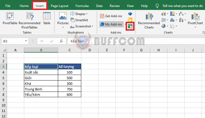
For example, suppose you have a table of the number of students who achieved different levels of academic performance as shown below. To create a People Graph to show the number of students in each level, select the entire data table. Then, select the Insert tab on the toolbar. Next, select the blue icon for “Transform cold data into a cool picture” under the Add-ins section.
Tips for creating a People Graph in Excel
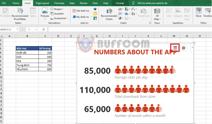
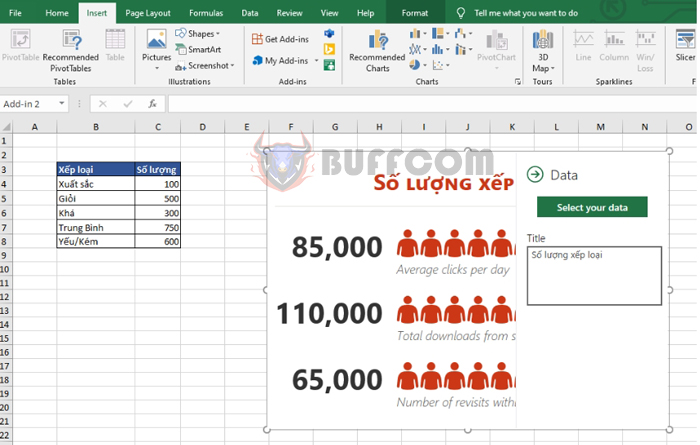
At this point, the People Graph table will appear. Left-click on the table, then click on the Data button to add data to the table.
Tips for creating a People Graph in Excel
In the Data tab, give the table a title and click on the Select your data button to add data to the graph.
Tips for creating a People Graph in Excel
A message will appear saying “Select your data to create a chart“.
The SAMPLE DATA section will display the sample data, and the “You’re selected 6 rows and 2 columns” message indicates that you have selected 6 rows and 2 columns of data for the graph. Click Create to generate the graph.

Tips for creating a People Graph in Excel
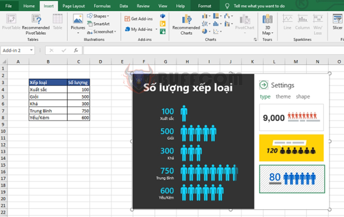
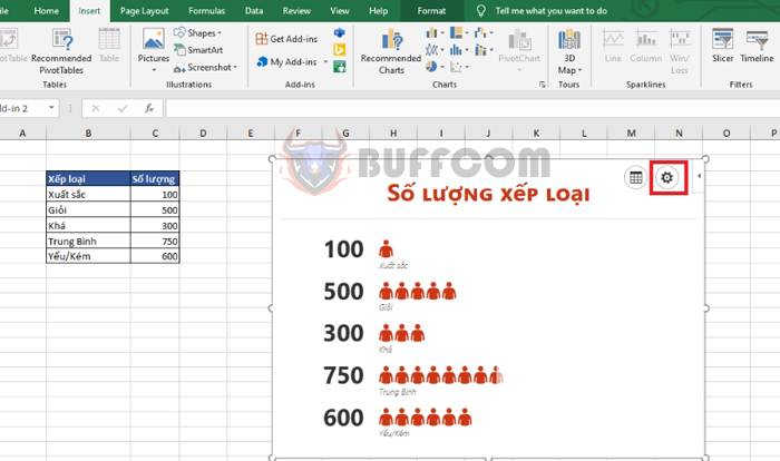
That’s all it takes to create a People Graph that shows the number of levels achieved. Now, you can format your graph by selecting the Settings button.
Tips for creating a People Graph in Excel
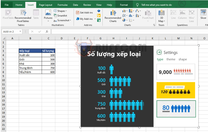
Under Settings, there are three tabs to choose from:
- Type: Select the type of graph.
- Theme: Choose the theme color of the graph.
- Shape: Choose the icon shape for the data.
If you want to change the data in the graph, simply select the Data tab, re-select the data, and then click Create.
 Thus, the article has guided you on how to create a People Graph in Excel. We hope this article will be useful for you in your work. Good luck!

