8 Microsoft Word Tips for Creating Professional-Looking Documents ( P2)

8 Microsoft Word Tips for Creating Professional-Looking Documents: As you may already know, Microsoft Word provides you with numerous tools for composing and formatting various types of documents. But which features should you use to create professional-looking documents? Here are some helpful tips.
Format by using columns when they are appropriate.
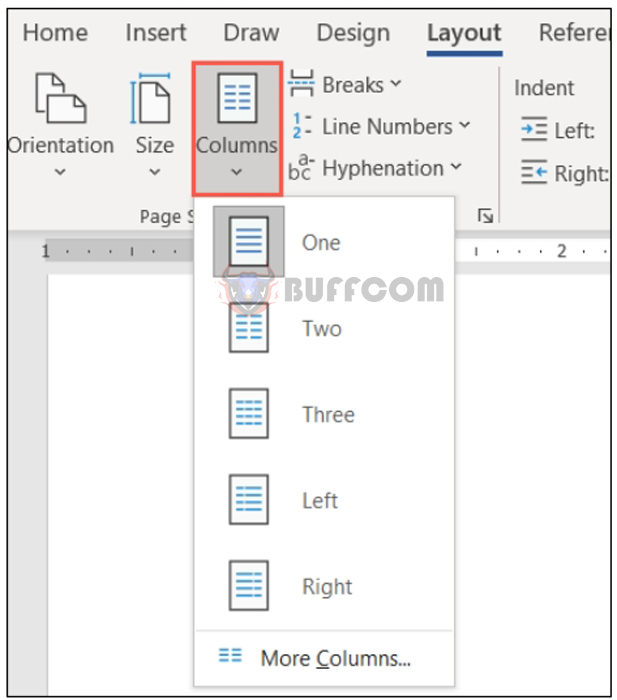
Columns have their positions in certain types of documents like advertisements and newsletters. If you are creating this type of document, go to the Layout tab and use the Column drop-down menu to select the number of columns.
For additional options, select “More columns” at the bottom. Then, you can use the preset values, choose the width and spacing for each column, and apply it to the entire document or only certain sections.
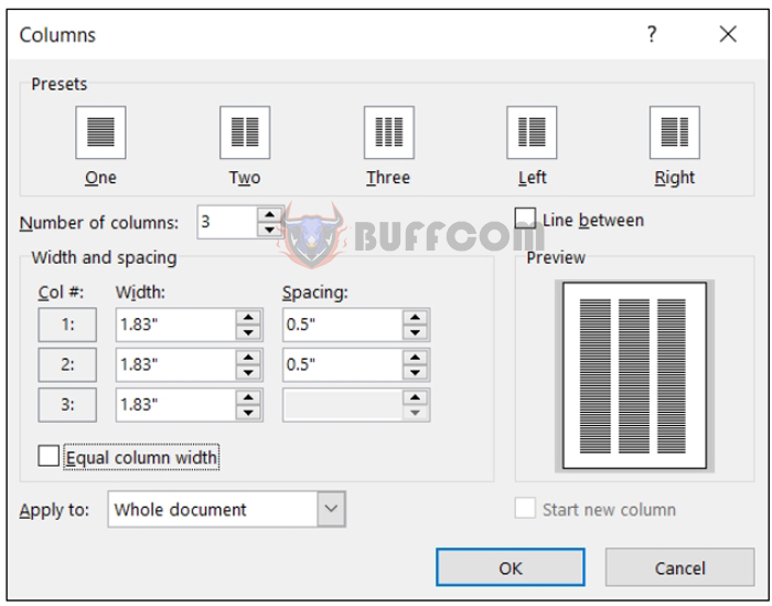 Just note that columns are only useful if the type of document you are composing suits them. This gives your document a newspaper-like format that may not be suitable for school essays, business proposals, or company reports.
Add headings to identify sections.
If you have a long document or a document that could benefit from different sections, you can apply headings to identify those sections. This not only helps visually separate the document for easy reading but also aids in creating a table of contents.
To apply a heading, select the text and go to the Page Layout tab. Use the box in the Styles section to choose Heading 1 or Heading 2, depending on the size and style you want.
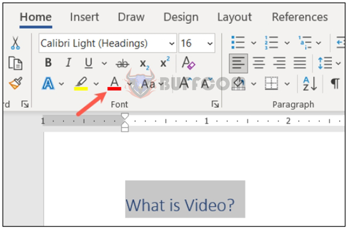
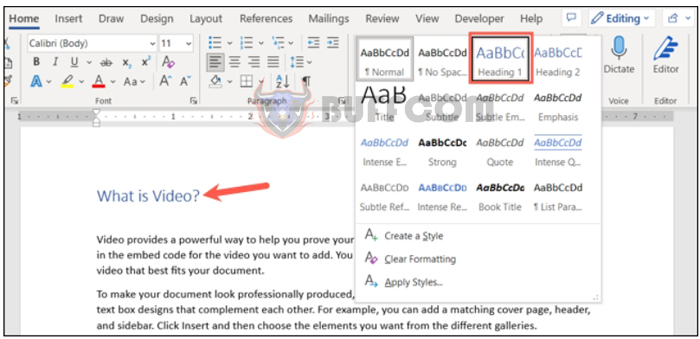 You can also change the color of the heading. For example, it may display in blue, and you want it in black. Select the heading and use the font color dropdown in the toolbar above the text or in the Font section on the Page Layout tab.
 Position images between text and paragraphs.
You might be adding images to your document. You have various ways to adjust the appearance of images in Word, with one way being how they are positioned with the text around them.
For example, you can have a small decorative image nestled within the text where the words surround it. Or you might have a large explanatory image that stands on its own between paragraphs.
Select the image and click on the Layout Options button that appears at the top right (Windows only).
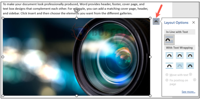
Additionally, go to the Format Picture tab and use the Position and Text Wrapping dropdown menus in the Arrange section of the ribbon.
 Position and Text Wrapping buttons on the Format Picture tab
Then, you can wrap the text around the image with various spacing options, position the text above and below the image, or only wrap the text around the left or right side.
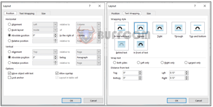
For more options, select “See more” in the Layout Options popup or “More Layout Options” in the Position or Text Wrapping menus.
Position and Text Wrapping settings in the Layout dialog box
 Use Alignment Tools for Images and Objects.
Another tip to make your document look visually pleasing is to use Word’s alignment tools for elements like images, shapes, or objects. You can use the Alignment Guides that appear when you move an element on the page or turn on Gridlines, which appear and persist when enabled.
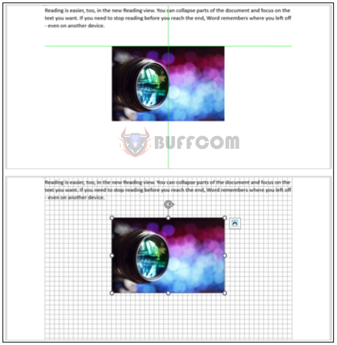 These two tools can help you evenly distribute space and align your objects side by side to make them look neat and organized.
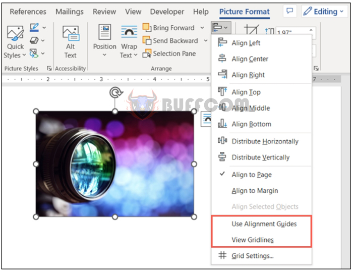
Tip: To get help moving your images, refer to our guide on how to move pictures freely in Word. Go to the Format Picture, Format Shape, or Format Graphic tab, depending on the type of item you’re using. Then, open the Align dropdown menu to select “Use Alignment Guides” or “View Gridlines.” Note that you cannot use both simultaneously.
8 Microsoft Word Tips for Creating Professional Looking Documents ( P2)
Alignment Guides and Gridlines in the Align menu
We hope these suggestions will help you create a professional Word document.

