5 Tips For Designing Professional PowerPoint Presentations

Have you tried various methods but still feel unsatisfied with your PowerPoint presentation? Buffcom will share with you 5 simple tips for designing professional PowerPoint presentations right here.
Utilize Available Professional PowerPoint Designs
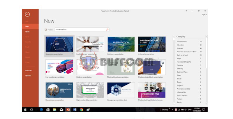
All versions of PowerPoint from 2003 to 2019 offer template designs. These templates not only include professional graphics but also pre-defined font styles, alignments, and more.
How to use: Launch PowerPoint, and a window will appear with the search box “Search for online templates or themes” below. You can choose from a range of PowerPoint templates immediately or enter keywords to search. On the home tab, click on Layout to select the layout for each slide. Use Design to change the background color and font style as desired.
 Follow the 6 × 6 Rule for Professional PowerPoint Design
One factor that can make PowerPoint presentations unattractive and unprofessional is overcrowding with too much detail and text on a single slide. The complexity of multiple ideas can strain the viewer’s eyes and make it difficult to follow.
The 6 × 6 rule indicates the maximum number of lines and characters per line on a slide. Each slide should have no more than 6 lines, and each line should have no more than 6 characters. Leaving sufficient white space on the slide helps people focus on the main content.

Simplify Color Choices Within Each Slide
Having too many colors on slides can be distracting. On the other hand, using a single color throughout can be monotonous and lack professionalism. Depending on the content and presentation field, you should choose a primary color scheme. Aim to combine a minimum of 3 colors and a maximum of 5-6 colors in one PowerPoint presentation.
The color scheme should be complementary and harmonious, for example, red-black-white or purple-orange-blue. Additionally, keep in mind that colors may appear different on a computer screen compared to when projected. You should use vibrant, clear colors and avoid excessively pale colors.
 Select Suitable Styles, Colors, and Font Sizes
In professional PowerPoint design, non-serif fonts like Arial are preferred as they are perceived as easier to read compared to serif fonts.
Furthermore, due to presentation purposes, font sizes should be at least 30pt, adjusting according to the specific font type. The font color should have high contrast with the background color. Avoid using two colors that are too similar in tone.
 Add Illustrative Images and Apply Transitions
A professional PowerPoint presentation should include relevant and specific visual illustrations. To make your slides more appealing, choose images that are directly related to the content you want to share. This helps convey the intended message. Arrange the images logically and avoid overusing them, which could distract from the main content.
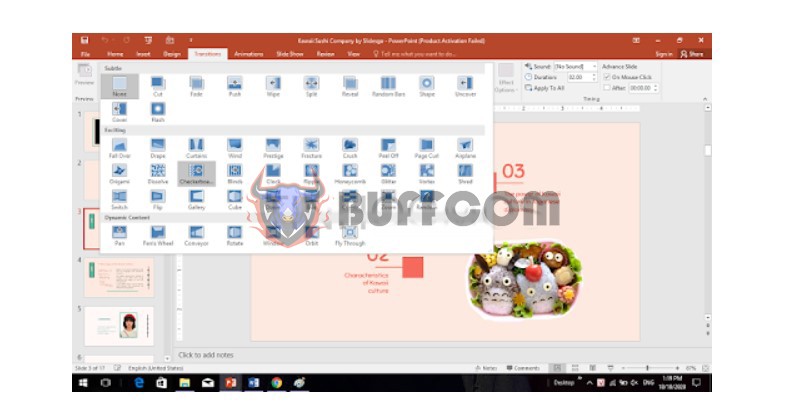
Meanwhile, presentation transitions can make the slides more dynamic and less monotonous. Click on Animations to apply motion effects to text and Transitions to add transitions between slides. Combine different types of effects to enhance visual appeal.
 These are 5 simple tips for serving professional PowerPoint design. We hope they can help you create effective presentations. If you need genuine Office software, please contact Buffcom.net for assistance!


