How to Create Pie Charts (2D and 3D) in Excel
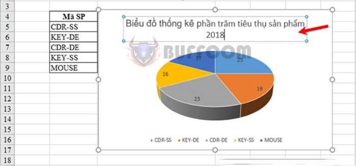
How to Create Pie Charts (2D and 3D) in Excel: A pie chart (2D or 3D) is a great way to visually represent data. By using the proportions of the pie slices, viewers can easily see the relationship of each data segment to the whole. Pie charts are especially useful when you need to analyze, compare, or contrast data. Here is a guide on how to create and modify different types of pie charts in Excel.
Step 1: Prepare the data source for creating the chart
Unlike other chart types, pie charts in Excel require the data source to be arranged in a column or a row. Therefore, each chart represents only one type of data.
You can add category names to a column or row, and it’s recommended to be the first column or row in the selection range. The category names will appear in the chart legend or chart title.
Note:
- There should be only one data series. If you have multiple series and still want to create a pie chart, you can use the Doughnut chart type.
- No negative values should be present in the data.
- No values should be zero (or empty) in the data, as they won’t be displayed in the pie chart.
Avoid having more than 7-9 data components, as too many slices can make the chart difficult to interpret.
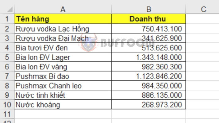
For example, let’s say we want to create a pie chart from the following table:
You need to select the entire table, including both title cells.
Step 2: Create the chart
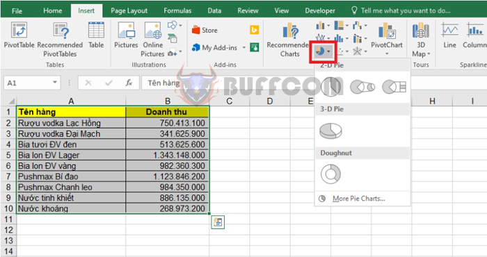
Select the “Insert” tab and choose the pie and doughnut chart icon (Pie & Doughnut). Then, select the desired pie chart type. Excel offers the following chart types: 2-D Pie, 3-D Pie, and Doughnut.
 2-D Pie Chart
To create a regular 2D pie chart, choose the chart type under “2-D Pie.”
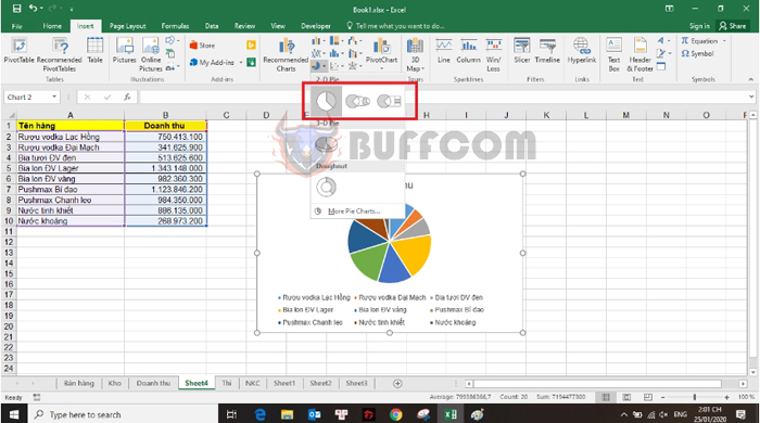
In the 2D chart, besides the regular pie chart, you’ll also have Pie of Pie and Bar of Pie chart types. These chart types are useful when you have too many small slices in your chart. These slices will be displayed outside the main pie chart.
When using these two chart types, the last three data points in the data table will appear in the secondary chart. So, you need to arrange the data accordingly.
3-D Pie Chart
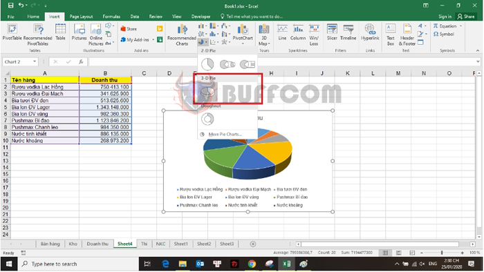
If you want to create a 3D pie chart, select the chart type under “3-D Pie.”
 Doughnut Chart
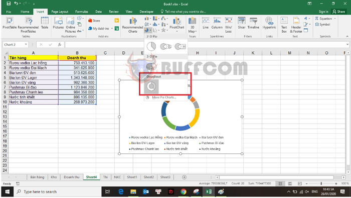
If you have multiple data series and still want to create a pie chart, you can use the Doughnut chart type. Simply select the chart type under “Doughnut.”
 Step 3: Customize the pie chart
After creating the pie chart, you’ll need to make some customizations to make it more informative and visually appealing.
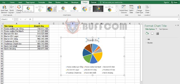
Edit the title of the pie chart.
Double-click on the chart title and edit it according to your needs.
 Move and resize the pie chart.
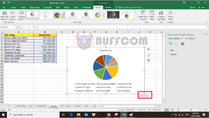
Click and hold the left mouse button on the pie chart, then drag it to the desired position.
To resize the pie chart, place the cursor on the 8 resizing handles around the chart’s border. When the two-way arrow appears, click and hold the left mouse button to adjust the size as desired.
How to Create Pie Charts (2D and 3D) in Excel
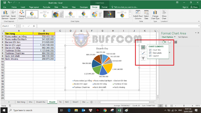
Add data labels to the pie chart.
Click on the plus icon next to the pie chart, then check the Data Labels option to display the data labels.
That’s it! This article has guided you on how to create pie charts in Excel. Good luck with your charting!


