4 Types Of Charts To Avoid Using In Excel Dashboards

Each data problem is suitable for a specific type of chart. However, there are certain chart types that are not applicable for any dashboard. Here are 4 types of data charts that you should avoid using when creating a dashboard in Excel.
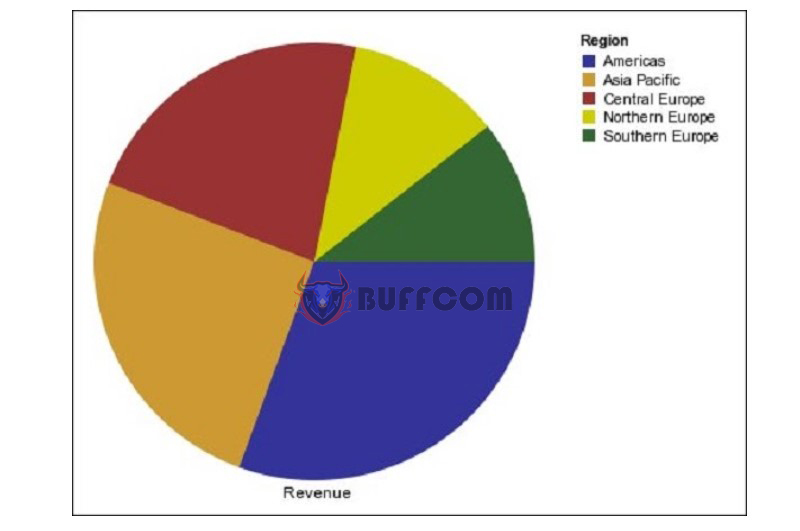
Pie Chart
Pie chart is a commonly used chart in various reports. However, it is not a good chart for business data analysis. Especially when there are equal numbers in the data table, it is difficult to determine which data component is larger and by how much. To help readers better understand the chart, you need to label the data for each part of the pie chart.
It is best to use a horizontal bar chart for a pie chart.
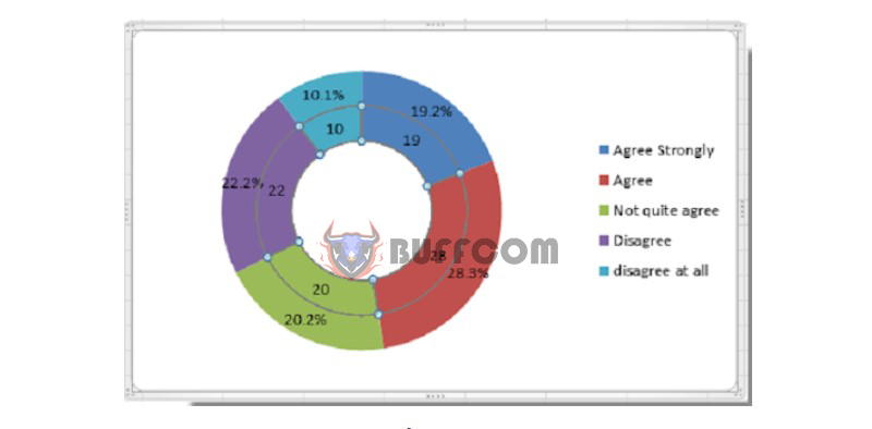
 Donut Chart
Donut chart is similar to a pie chart. If a pie chart makes it difficult for readers to distinguish the area of each part, the donut chart has almost equal arcs. It is not easy for many people to identify the quantitative value of the circular arcs.
 3D Chart
A principle to remember when building a chart in Excel is not to use a 3D chart unless you are representing data in 3D space. 3D charts cause values to be distorted compared to the flat surface. In addition, it also has many unnecessary details such as the background and floor. The chart will become difficult to read, understand, and compare.
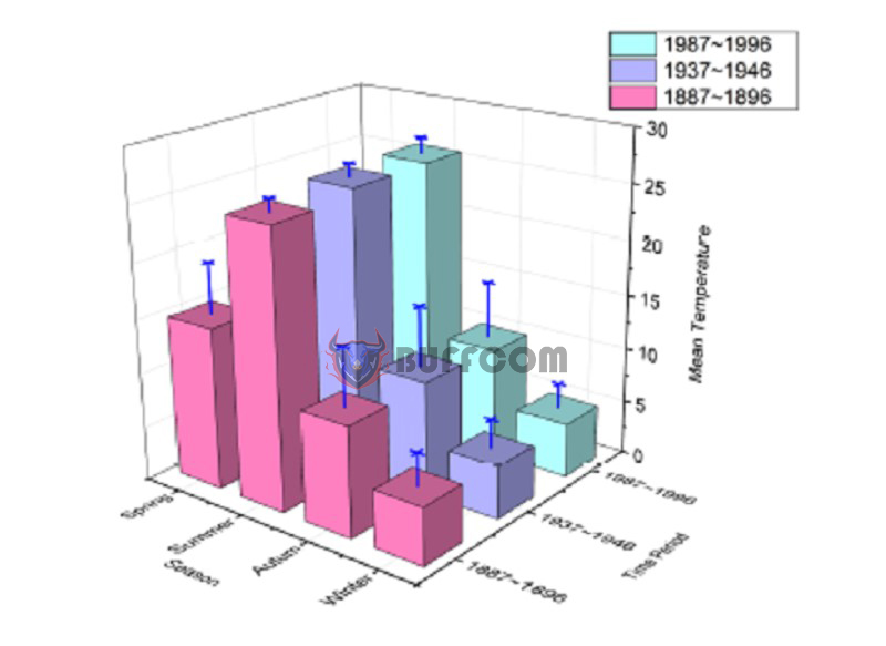 Chart with Two Vertical Axes
You can represent multiple data on one x-axis, however, you should not draw a chart with two vertical axes. If the units and value ranges of these two vertical axes are different, the reader will feel confused, hard to understand and spend a lot of time reading data.
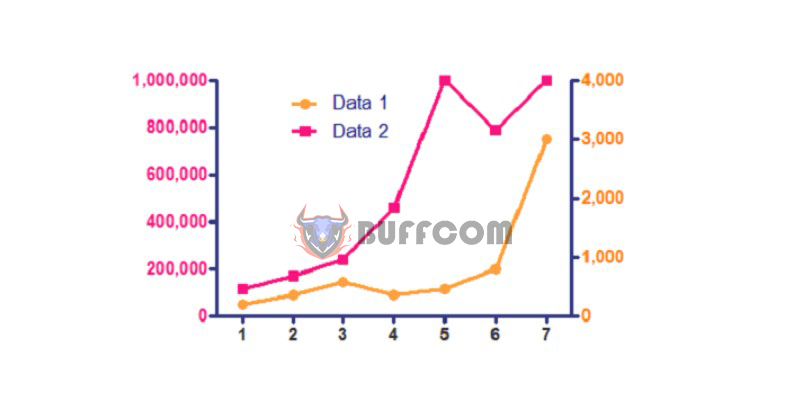 Instead of using two vertical axes, you can directly assign values to a chart. In addition, pull the chart vertically and have a separate vertical axis for each chart, using a common x-axis. As long as each chart has only one vertical axis.
Conclusion
The above article has shared about 4 types of charts to avoid using in Excel dashboards. You need to choose a chart that is easy to see and read to convey information to readers most easily.
If you want to dive deeper into creating reports using charts, as well as other skills in data processing and analysis, you’ll need a fully-featured software. Contact Buffcom.net for support!

