How to choose appropriate visual images for Excel data

How to choose appropriate visual images for Excel data. Excel is an indispensable tool for “business people” used to enter, manipulate, and analyze data. In particular, it is considered one of the best tools for creating report charts.
However, with the variety of chart types in Excel such as pie, column, table, waterfall, scatter, etc., users are often unsure which type to use to present their data. Therefore, in this article, let’s explore with UniTrain how to use different charts for each case.
Trends over time in Excel
For data sets containing time and numerical values (as shown below), users often want to track trends in a specific quantity over time, such as sales revenue over a year.
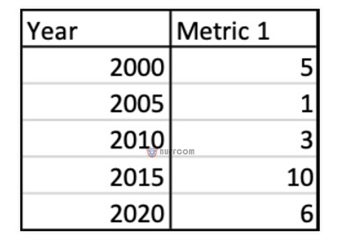
How to choose appropriate visual images for Excel data
To find the charts that Excel suggests for this type of data, follow these steps:
Step 1: Insert the data into an Excel worksheet.
Step 2: Select the data > click Insert on the toolbar > Recommended Charts.
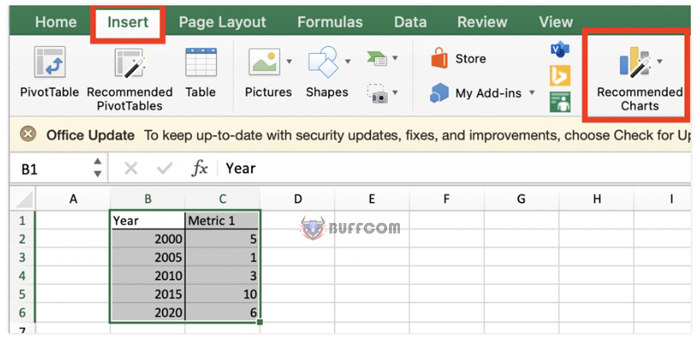
How to choose appropriate visual images for Excel data
For this data set, Excel typically suggests line, pie, and area charts.
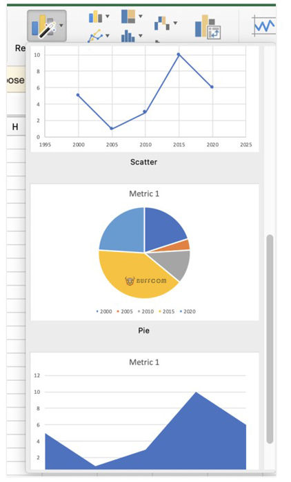
How to choose appropriate visual images for Excel data
In general, if you want to display trends over time, use a line chart.
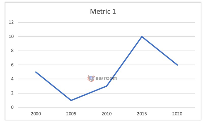
How to choose appropriate visual images for Excel data
Trends over time in multiple data sets visual images
For data sets containing time and other numerical data (as shown below), users tend to track changes in quantity over time (e.g., heart rate, blood pressure, etc. within an hour).
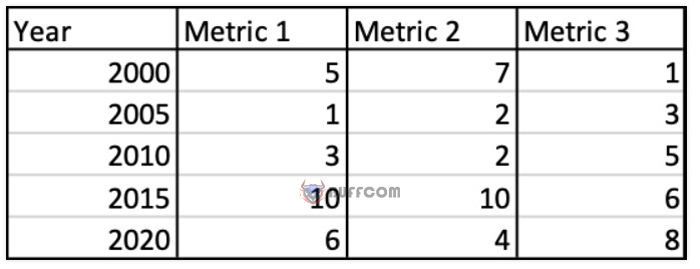 For this type of data set, Excel suggests many different options, including bubble charts, stacked bar charts, and stacked area charts.
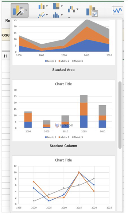 Comparing categories on data
For a dataset consisting of categories and numbers (as shown below), users tend to evaluate the degree of comparison between different categories for a certain data point (e.g., voting results of different candidates).
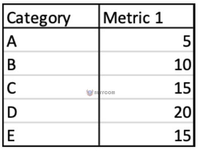 For this dataset, bar charts, pie charts, and histograms are appropriate choices for visualizing data.
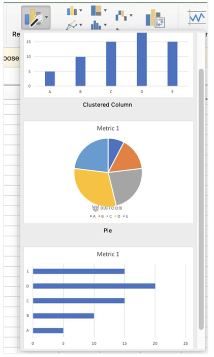
In general, if users need to compare categories, they should use bar charts because this type of chart will help users easily compare data.
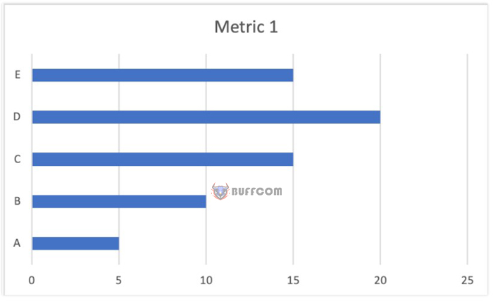 Although bar charts may also be suitable for this dataset, the best approach is to use bar charts if the X-axis represents time horizontally. This is because readers are accustomed to consistent representation of time horizontally from left to right and representation of categories vertically from top to bottom. As a result, users can absorb visual images faster and more easily.
Comparing categories for components of the whole
For a dataset consisting of categories and percentage proportions (as shown below), users tend to evaluate the degree of comparison between different categories for a certain index in a larger part of the whole (e.g., percentage of people who agree/disagree in a survey).
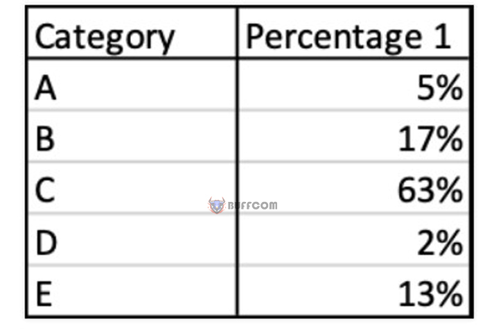
For this dataset, Excel will suggest using bar charts, pie charts, and histograms.
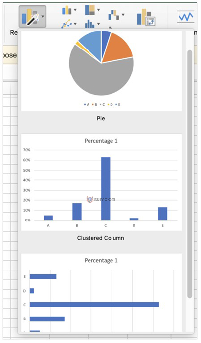
In summary, Excel has many different datasets and types of charts. In this article, Buffcom suggests some of the most commonly used chart types for work:
1. If you need to show trends over time (for one or more indicators), use line charts.
2. If you need to compare categories (on a data point or for parts of the whole), use bar charts.


