2 Simple Ways To Draw Histogram Charts In Excel For All Versions

Excel is one of the versatile software that helps us to easily compute and manipulate large data sets. Additionally, you can also create charts directly in Excel through the histogram charting function. This is a frequency chart that visually represents data in a concise and intuitive manner. Let’s find out more about how to draw a frequency chart and the operations with this function together with Buffcom.net.
What is a Histogram Chart? Meaning of Frequency Chart
A histogram chart is a bar chart form of a frequency chart, where each column represents a certain range of values instead of a fixed value. The frequency chart shows the distribution of a process or product in a concise and approximate manner without losing the information of the entire data.
This is one of Japan’s 7 Quality Management Tools, applied to objects with a large amount of aggregated and difficult-to-manage data.
Currently, the frequency chart is widely used in tracking the variation of a process or product, thereby providing appropriate evaluations and future handling directions.
Meaning of Frequency Chart:
- Data is clearly distributed and easy to understand
- Track the occurrence of data
- Predict future growth/decline
- Components in Histogram Data
The components of a histogram data
Typically, a frequency data set includes four main components: the x-axis, y-axis, width, and height
- X-axis: Represents measured values
- Y-axis: Represents the number of data occurrences
- Width of each column: Equal to class intervals
- Height of each column: Corresponds to the frequency of each value
- Histogram Chart
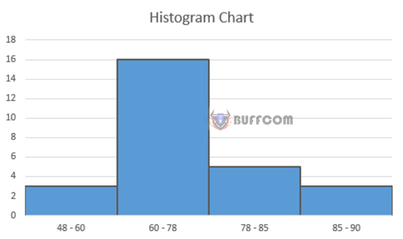 Common Types of Frequency Charts:
- Two-sided missing chart
- One-sided missing chart
- Missing peak chart
- Two-sided high chart
- Two-peak chart
How to Draw a Histogram Chart in Excel
You can draw a frequency chart as follows. However, first, you need to prepare a data table.
Step 1: Based on the data table, divide the data into appropriate value ranges (usually continuous ranges and variable non-duplicates)
Step 2: Calculate how many values are in each range
Formula: =COUNTIFS($C$3:$C$22,”>=24″,$C$3:$C$22,”<40″)
Where: $C$3:$C$22 is the data range, “24” and “40” are the range for the first interval.
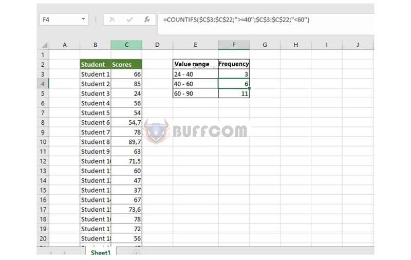
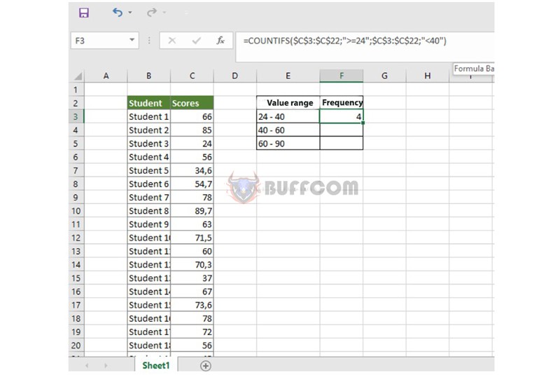 Step 3: Perform the same calculation for the remaining value ranges.
You perform a similar formula, replacing the values of the corresponding range (as in the example).
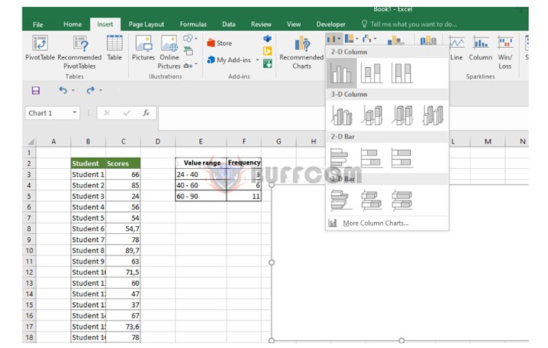
 Step 4: At Insert on the toolbar, select the column chart type and click on a chart type.
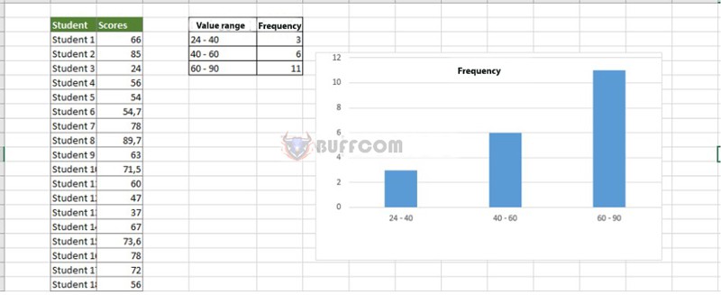
 Then, a frequency chart will be generated as shown below.
 Step 5: Format the chart.
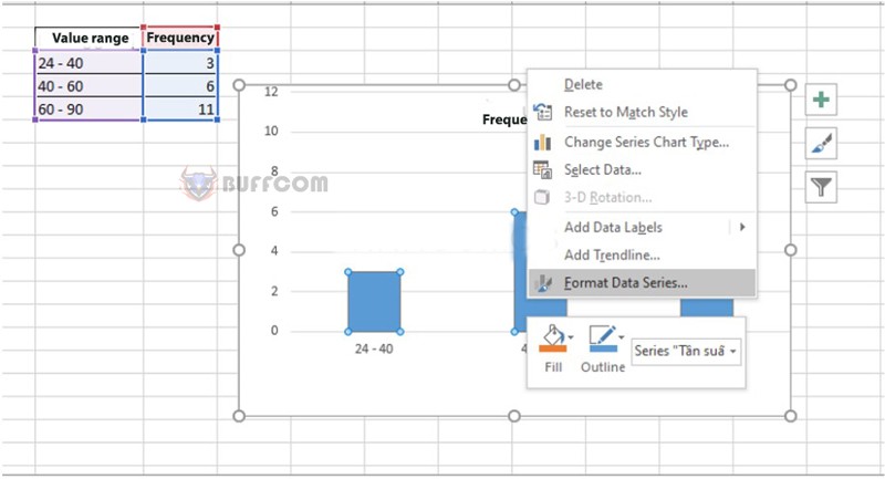
Right-click on the chart and select Format Data Series.
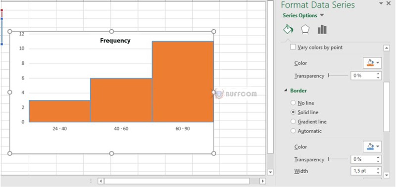
 A dialog box appears, where you can customize the formats as shown in the template:
 After that, the completed frequency chart will look like the image below.
 How to Draw a Frequency Chart Using Analysis Toolpak.
In addition to the above method of creating a frequency chart, you can also create a chart using the Analysis Toolpak. This method also applies to Excel 2019, Excel 2016, Excel 2013, and Excel 2010.
First, you need to install the Analysis Toolpak feature in Excel to be able to perform the operation. Go to the File tab, select Options, and then select Add-ins.
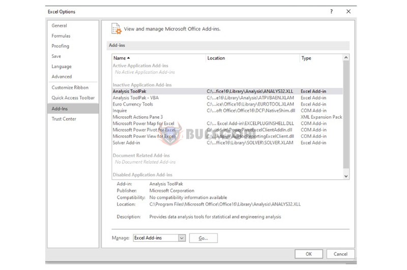 A window will appear, select the Analysis Toolpak line, click Go, and check the Analysis Toolpak – VBA line, then press OK to complete.
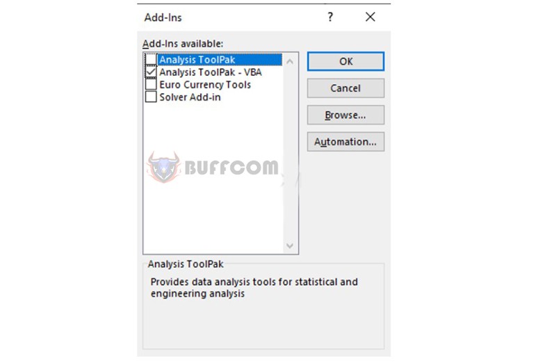 Proceed to draw a histogram chart for the data table.
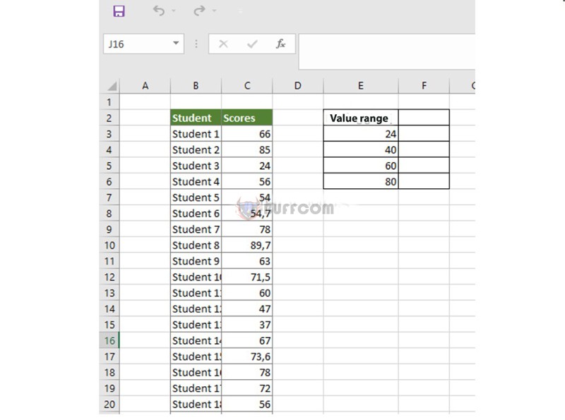
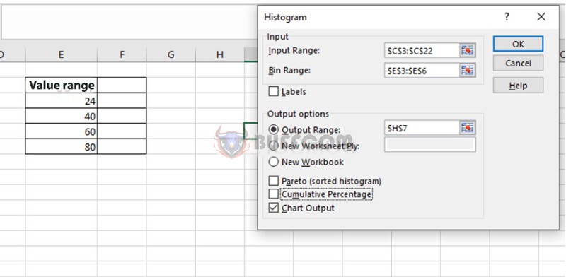
Step 1: Create a bin range for the data. The first range will give the number of students who score below 24. The second range will give the number of students who score from 24 to less than 40…
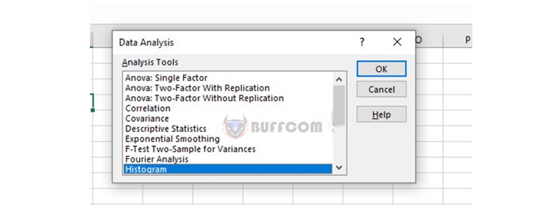
 Step 2: In the Data tab on the toolbar, select Data Analysis.
 Step 3: A window will appear, select Histogram and press OK.
 Step 4: Select the parameters for the chart
- Input Range: The range that contains the data from beginning to end.
- Bin range: The range created in step 1.
- Output Range: The position where the result will appear.
- Chart Output: Create a probability distribution chart and histogram.
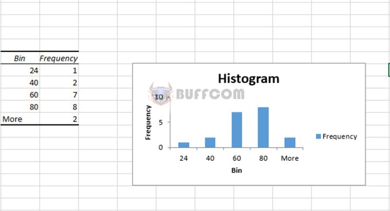
 Finally, press OK, and you will get a histogram chart as shown in the figure.
 Summary of Histogram Chart
So, to create a histogram chart in Excel, you can follow the instructions above. We hope that with the sharing above, it will make your Excel usage much easier.
Currently, Buffcom.net is providing cheap genuine office software. If you are interested, please contact us to buy genuine software!

