How to Create a Burndown Chart in Microsoft Excel

Whether you are working with a team or alone, it is important to keep track of a project’s schedule. One useful tool for this purpose is a burndown chart created in Microsoft Excel. These charts are line graphs that compare the estimated time required to complete each task with the actual time taken to complete each task.
In this tutorial, I will show you how to create a burndown chart in Excel and explain the significance of each line in terms of scheduling and meeting deadlines.
What is a Burndown Chart?
Effective time management involves maintaining a sustainable pace, and burndown charts can help with that. A burndown chart is a line graph that visually represents the remaining tasks versus the time left to complete them. Burndown charts allow team members to track progress and adjust their efforts to meet their goals going forward.
In some cases, initial expectations may have been unrealistic. When this happens, team members can reassess priorities and make necessary changes before things get out of hand.
While burndown charts can help your team meet deadlines, they should be viewed as warning signs or indicators of smooth progress. The key is to report frequently and reallocate resources as needed.
How to Prepare the Data in Excel
Creating a burndown chart in Excel is easy, but setting up the data requires a good understanding of what the chart represents. You will need three columns, as shown in Figure A. The data in this example represents the goal of completing five tasks within a two-week timeframe.
Figure A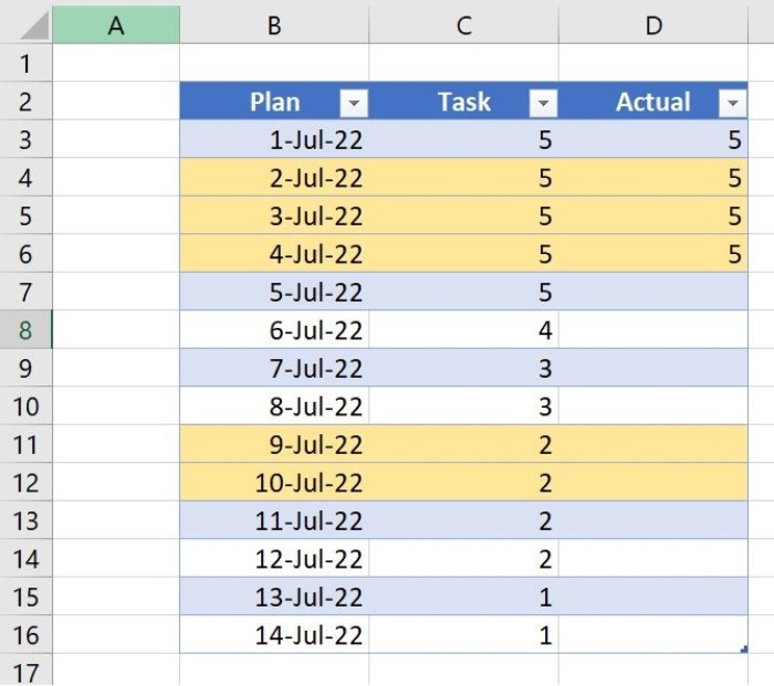
A burndown chart requires three columns in Excel.
The first column contains the dates. The second column estimates the number of days each task should take. You start with a total of five tasks and end with one:
- Task 5 should take two days but spans a weekend and a holiday.
- Task 4 should take one day.
- Task 3 should take two days.
- Task 2 should take two days but spans a weekend.
- Task 1 should take two days.
The total number of days in the second column should add up to 14, which it does. The yellow highlighting denotes weekends and holidays. Highlighting the days when you don’t work helps avoid accidentally scheduling tasks on those days.
The third column is a countdown of the tasks completed each day. In this example, you completed Task 5 in one day instead of the scheduled two days. This means you are one day ahead of schedule.
Now that you understand what the data represents, let’s proceed to building the chart.
How to Create the Chart in Excel
You are now ready to create the chart based on the three columns of data shown earlier in Figure A. To do this, select the entire data set B2:D16 and follow these steps:
- Click the Insert tab.
- In the Charts group, click on the Insert Line or Area Chart option and choose Line With Markers (Figure B).
Figure B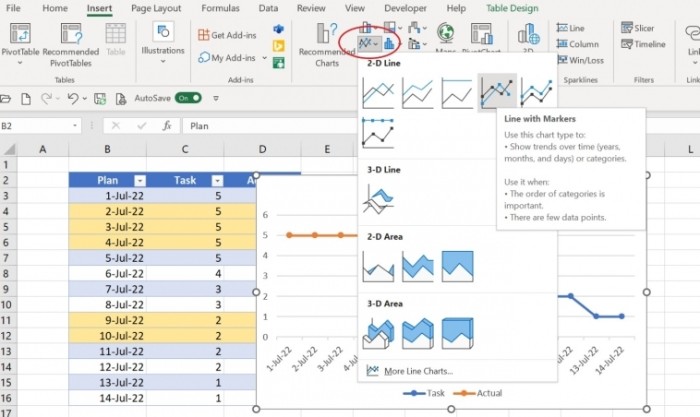
Choose a line with markers chart.
As shown in Figure C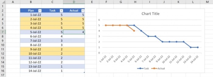 , the blue line represents the estimated number of days, while the red line represents the actual number of days per task. The two lines start together on July 1 and continue together through July 4. On July 5, you start Task 4 one day ahead of schedule, causing the red line to dip below the blue line.
As you update the data in the Actual column, the chart will adjust accordingly:
- The red line will be above the blue line when you are behind schedule.
- The red line will match the blue line when you are on schedule.
- The red line will dip below the blue line when you are ahead of schedule.
Figure D shows the red line returning to the blue line because you took two days instead of one to complete Task 2. Although you are still on schedule, you are no longer one day ahead.
Figure D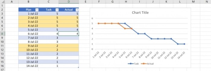
You’re still on schedule, despite losing a day on Task 4.
Figure E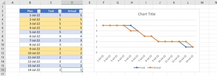
You finished on time.
As shown in Figure E, you met the two-week deadline for all five tasks. However, you did fall behind by a day because Task 2 took three days instead of the planned two. Fortunately, you made up for it by completing Task 1 in just one day.
How to Use a Burndown Chart Created in Excel
With a quick glance at the burndown chart, you can assess progress or lack thereof. Ideally, you want to see the blue line consistently above the red line, indicating that you are ahead of schedule. However, it is normal for the red line to occasionally meet or dip below the blue line.
If the red and blue lines closely follow each other for extended periods, it may be necessary to reallocate resources to keep the blue line above the red line. This allows for unexpected delays. When the lines closely align, there is a risk of falling behind schedule.
Use burndown charts to stay on top of your schedule and intervene when necessary to keep the project on track.

