How to create a fun people chart in Microsoft Excel

A people chart is a visually appealing infographic that tells a story using related images of people. Unlike traditional column or line charts, people charts are more engaging and can convey information at a glance. In this tutorial, I’ll guide you through creating a people chart in Microsoft Excel.
How to create a fun people chart in Microsoft Excel
Install the People Graph add-in:
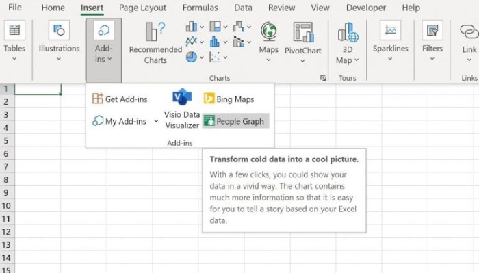
- Click on the “Insert” tab in Excel.
- Open the “Add-ins” dropdown menu and select “People Graph.” Note that the terms “graph” and “chart” have slight differences, but for this tutorial, we’ll refer to it as a chart.
- This will open the Microsoft Store, where you can download and install the People Graph add-in.
Prepare the data:
- To populate the people chart, you’ll need some data.
- Create a simple dataset similar to the one shown in Figure B of the tutorial.
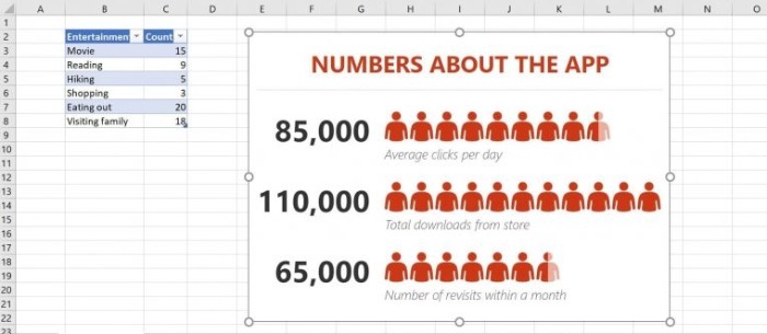
- Trust the add-in by clicking the “Trust This Add-in” button, which will generate a dummy chart with sample data.
Connect the chart to real data:
- Click on the dummy chart and then click the “Data” icon located in the toolbar.

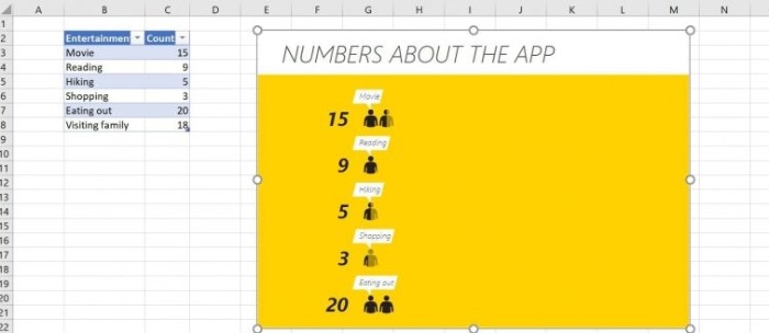
- In the settings pane, click “Select Your Data” and choose the appropriate data range, such as the entertainment survey table shown in Figure B.
- Click “Create” to connect the chart to your data. Note that the dummy chart must be on the same sheet as the data set.
Customize the people chart:
- By default, the chart has a preset design, but you can customize it to your liking.
- Click on the settings icon (gear icon) in the toolbar and choose “Type” to select from the three defined chart types.
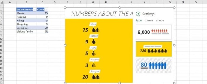
- Next, choose a theme from the seven available options to change the appearance of the chart.
- Additionally, you can change the shape of the people icons by selecting one of the 16 available options.
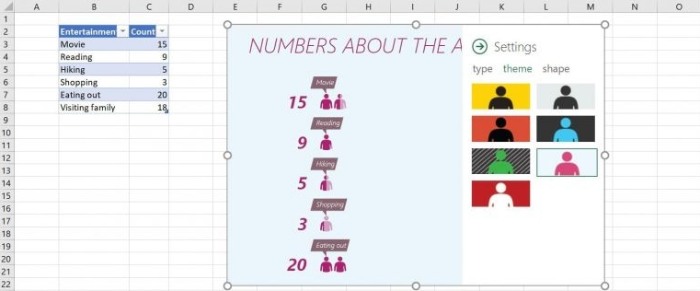
- Close the settings pane to see the final customized chart.
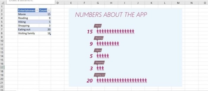
It’s worth noting that if you use a table object to store the source data, the people chart will automatically update whenever you modify the data. People charts can be a visually appealing addition to dashboards, bringing a dynamic and interesting element to your data presentation.
Creating a people chart in Excel is a quick and easy way to transform your data into an engaging visual representation that can effectively communicate information with just a glance.


