How to draw a stacked column chart in Excel

How to draw a stacked column chart in Excel: The stacked column chart is commonly used in Excel to visually present data using vertical column shapes. It is a useful tool to help viewers easily see changes in data for comparison and contrast. If you want to draw a stacked column chart in Excel but don’t know how, please refer to the following guide.
Step 1: Create the chart
First, to draw the chart, you need to have a data table. Open the data table and select it. For example, we have the following data table:

How to draw a stacked column chart in Excel
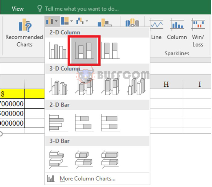
Next, on the toolbar, select the Insert tab. To create a stacked column chart, click on the Stacked Column option in the 2-D Column section, as shown below.
How to draw a stacked column chart in Excel
Step 2: Customize the chart
Create a chart line
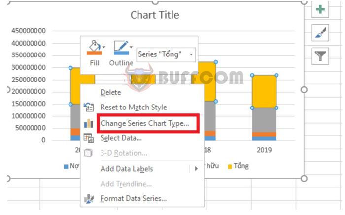
After completing step 1, the chart will automatically appear. However, the “Total” data is also in the stacked column. Let’s separate this “Total” data to have a more comprehensive view. To separate the “Total” data, follow these steps:
- Right-click on the color of the “Total” data.
- Select the Change Series Chart Type option.
How to draw a stacked column chart in Excel
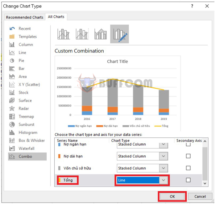
- Then select Line in the Total section and select the chart line you want, then click OK.
How to draw a stacked column chart in Excel
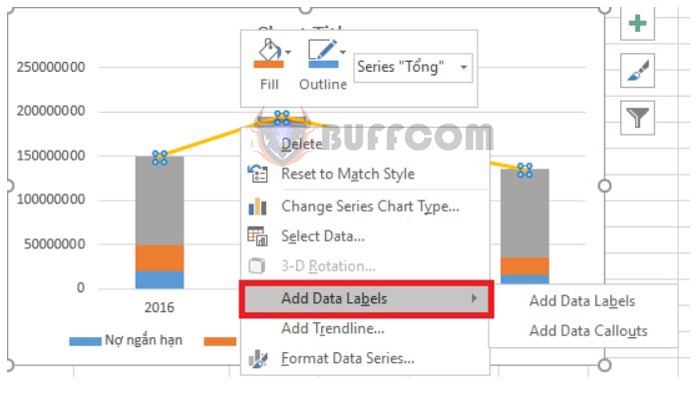
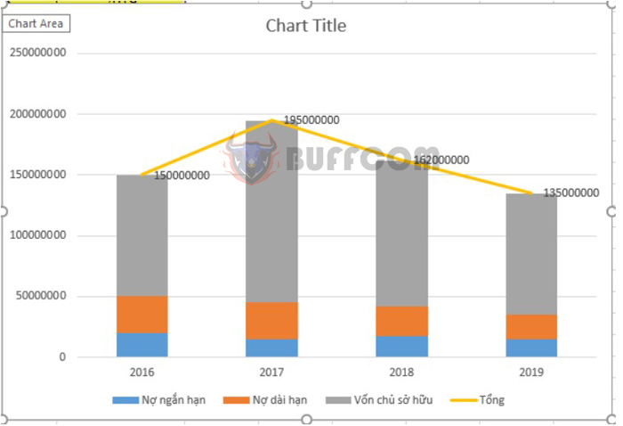
To display the total data, right-click on the chart line you just created and select Add Data Labels.
How to draw a stacked column chart in Excel
The result will be displayed as follows:
How to draw a stacked column chart in Excel
Hide the chart line
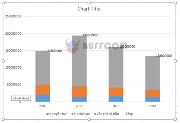
If you do not want to display this Total line, you can completely hide the chart line. Please follow these steps:
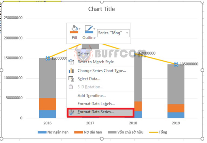
- Right-click on the Total data line.
- Select the Format Data Series option.
How to draw a stacked column chart in Excel
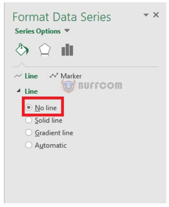
Under the Line Color section, select No Line.
How to draw a stacked column chart in Excel
The result will be displayed as follows:
How to draw a stacked column chart in Excel
Above is the guide on how to draw a stacked column chart in Excel provided by
Buffcom.net . Please refer to and apply it. Wish you success.


