• Microsoft Office
  • Microsoft Windows
  • Other Software
  • Anti Virus
  • Blog
    • Word
    • Excel
    • Powerpoint
    • Software tricks/tips
  • POLICIES
    • PAYMENT GUIDE
    • SHIPPING POLICY
    • REFUND POLICY
    • TERMS & CONDITIONS
    • Contact Us

No products in the cart.

  • Microsoft Office
  • Microsoft Windows
  • Other Software
  • Anti Virus
  • Blog
    • Word
    • Excel
    • Powerpoint
    • Software tricks/tips
  • POLICIES
    • PAYMENT GUIDE
    • SHIPPING POLICY
    • REFUND POLICY
    • TERMS & CONDITIONS
    • Contact Us

No products in the cart.

  • Microsoft Office
  • Microsoft Windows
  • Other Software
  • Anti Virus
  • Blog
    • Word
    • Excel
    • Powerpoint
    • Software tricks/tips
  • POLICIES
    • PAYMENT GUIDE
    • SHIPPING POLICY
    • REFUND POLICY
    • TERMS & CONDITIONS
    • Contact Us

No products in the cart.

  • Microsoft Office
  • Microsoft Windows
  • Other Software
  • Anti Virus
  • Blog
    • Word
    • Excel
    • Powerpoint
    • Software tricks/tips
  • POLICIES
    • PAYMENT GUIDE
    • SHIPPING POLICY
    • REFUND POLICY
    • TERMS & CONDITIONS
    • Contact Us
Excel

How to Utilize Excel Bubble Charts
0 Comments

How to Utilize Excel Bubble Charts. The Excel bubble chart is an extension of the scatter chart, adding one more dimension to the traditional scatter chart. It utilizes the size of the bubbles to indicate a numeric value, where larger bubbles represent larger values. The bubble size is determined by the smallest and largest numbers in the data.

How to Utilize Excel Bubble Charts

Example:

Creating a Bubble Chart in Excel (Month Vs Sales vs Manpower Data)
How to Utilize Excel Bubble Charts

How to Utilize Excel Bubble Charts

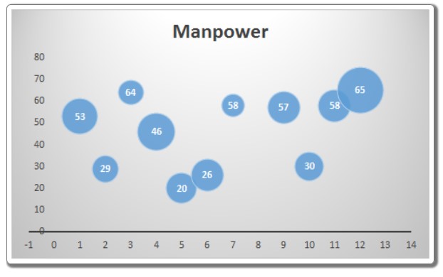
In this example, we have data that shows the manpower used in different months and the corresponding sales made in each month. We want to visualize the data, with months represented on the x-axis, manpower on the y-axis, and sales represented by the size of the bubble.

To create a bubble chart in Excel, follow these steps:

  1. Select the data.
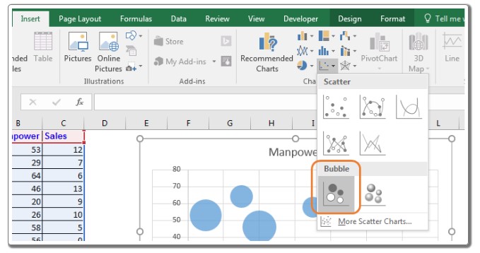
  2. Go to Insert => Charts => Scatter Charts => Bubble Chart.
    How to Utilize Excel Bubble Charts

    How to Utilize Excel Bubble Charts

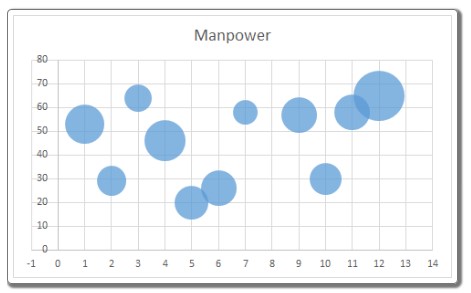
The chart is now ready.
How to Utilize Excel Bubble Charts

How to Utilize Excel Bubble Charts

Interpreting Excel Bubble Chart: In the above chart, the x-axis represents the month intervals, displayed with a default interval of two months. You can change it to one month from the axis options. The largest bubble is in the 12th month, indicating the highest manpower usage as it is higher on the chart’s Y-axis. The bubble size is also the largest, representing the highest sales volume. In the third month, we used a large manpower (64 – represented by its position on the y-axis), but the sales were relatively small (represented by the bubble size).

Best Use of Bubble Chart in Excel: It is most effective when you have three dimensions to visualize. It immediately attracts users’ attention.

Disadvantages of Bubble Chart: It may need explanation for first-time users who could get confused. Including too many variables can make the chart difficult to interpret.

Adding data labels in Excel 2010 and earlier versions was challenging, but it became easier in Excel 2013 and onward.

So, this is how you can use a bubble chart in Excel for data visualization. I hope this information was helpful. If you have any doubts regarding this article or any other Excel/VBA related topic, please let me know in the comments section below.


3
22 Views
How to Quickly Set/Create Password for PDF Files Using Microsoft WordPrevHow to Quickly Set/Create Password for PDF Files Using Microsoft WordAugust 4, 2023
Longest Toss Winning Streak - Using Excel FunctionsAugust 5, 2023Longest Toss Winning Streak - Using Excel FunctionsNext

Leave a Reply Cancel reply

Your email address will not be published. Required fields are marked *

Recent Posts
  • Retrieve Data Based on Data Validation
    September 7, 2023
    Excel
  • How to Convert Multiple Rows to Columns and Rows in Excel?
    September 6, 2023
    Excel
  • VLOOKUP for Automatic Discount in Data Validation
    September 6, 2023
    Excel
  • How to Convert Text Dates to Dates in Excel?
    September 5, 2023
    Excel
Categories
  • Blog 80
  • Excel 754
  • Powerpoint 36
  • Software tricks/tips 128
  • Uncategorized 8
  • Word 109
Tags
the ISERROR
Top rated products
  • AVG Internet Security 2021 1 Device 1 Year Global AVG Internet Security 2021 1 Device 1 Year Global
    Rated 5.00 out of 5
    $11.00
  • Buy Office 2021 Professional Plus Key Global For 5 PC
    Rated 5.00 out of 5
    $45.00
  • Avast SecureLine VPN 2021 2 Years 5 Devices Global Avast SecureLine VPN 2021 2 Years 5 Devices Global
    Rated 5.00 out of 5
    $47.00
  • Windows 11 Pro Product Activation Key - Latest version 2021
    Rated 5.00 out of 5
    $11.00
  • AVG Internet Security 2021 10 Devices 1 Year Global AVG Internet Security 2021 10 Devices 1 Year Global
    Rated 5.00 out of 5
    $30.00
Products
  • Buy Office 2021 Professional Plus Key Global For 5 PC
    Rated 5.00 out of 5
    $45.00
  • Buy Office 2021 Professional Plus Key Global Bind To Your Microsoft Account
    Rated 4.83 out of 5
    $49.00
  • Windows Server 2022 Datacenter Key Global
    Rated 5.00 out of 5
    $15.00
  • Windows Server 2022 Standard Key Global
    Rated 4.47 out of 5
    $15.00
  • Windows Server 2022 Remote Desktop Services Device Connections (50) Cal Key Global
    Rated 5.00 out of 5
    $45.00

Buffcom.net always brings the best digital products and services to you. Specializing in Office Software and online marketing services

BIG SALE 50% IN MAY

Microsoft Office
Microsoft Windows
Anti-Virus
Contact Us

Visit Us:

125 Division St, New York, NY 10002, USA

Mail Us:

buffcom.net@gmail.com

TERMS & CONDITIONS | PAYMENT GUIDE  | SHIPPING POLICY  | REFUND POLICY

Copyright © 2019 buffcom.net  All Rights Reserved.