Instructions for Drawing Graphs of Functions in Excel

Instructions for Drawing Graphs of Functions in Excel. During data processing, you may want to create a graph to make your data more rich and visually appealing while helping you and your audience understand the growth rate in that data. However, you may not know how to do it. Don’t worry, this article will guide you on how to draw a graph of functions in Excel. Let’s find out now!
Drawing Graphs of Functions in Excel and steps to follow:
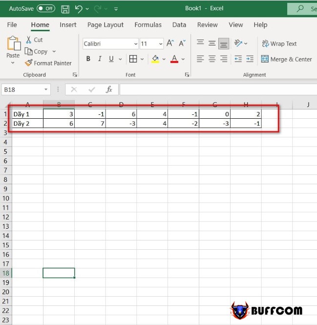
Step 1: First, you will prepare the corresponding rows of numbers for the data you want to graph, as shown below:
Instructions for Drawing Graphs of Functions in Excel
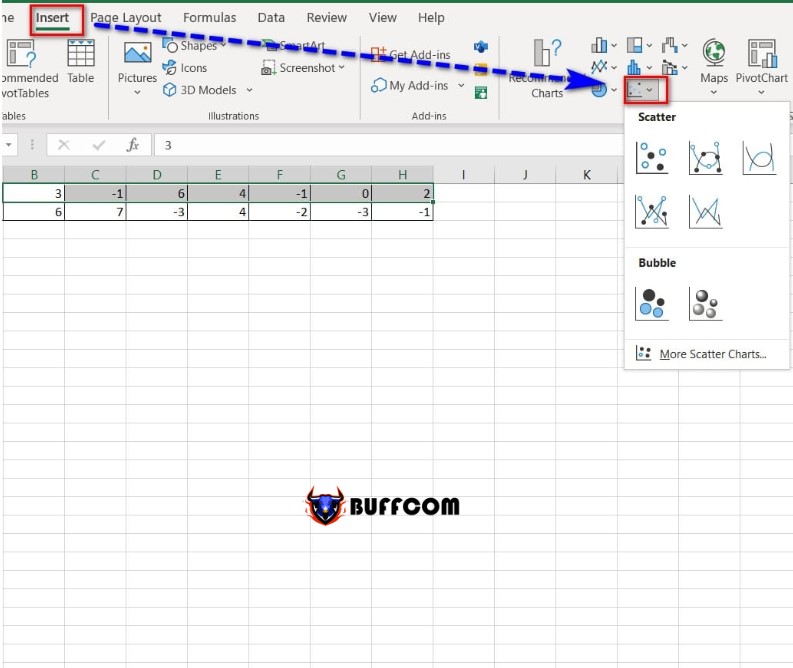
Step 2: Highlight the rows of numbers, and in the Insert tab, select the Scatter icon to display the graph.
Instructions for Drawing Graphs of Functions in Excel
Step 3: Select the graph you want to display.
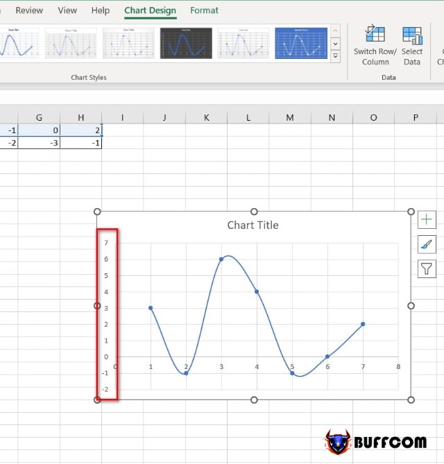
Step 4: After displaying the graph you have selected, continue by selecting the vertical axis displayed on the chart on the left side.
Instructions for Drawing Graphs of Functions in Excel
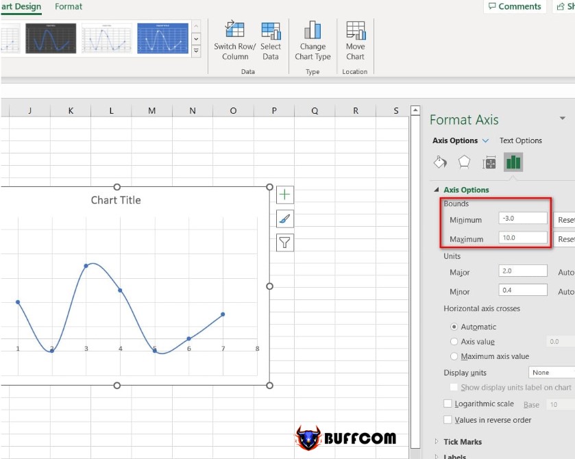
The interface adjusts the value of the displayed graph to the right. In the Bounds section, tick the minimum value as -3.0 and the maximum value as 10.0.
Note: The minimum and maximum values will depend on the smallest and largest values in rows 1 and 2.
Instructions for Drawing Graphs of Functions in Excel
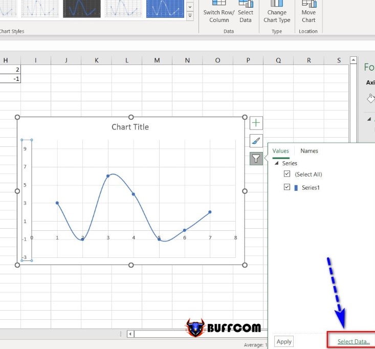
Step 5: In the function graph, right-click and select the funnel icon, then select Select Data.
Instructions for Drawing Graphs of Functions in Excel
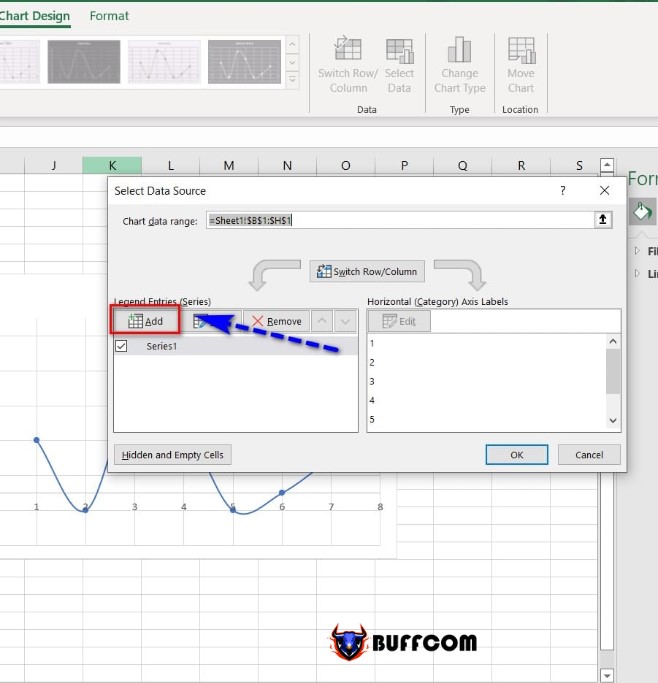
Step 6: Display the Select Data Source dialog box, click Add to add new values to the graph.
Instructions for Drawing Graphs of Functions in Excel
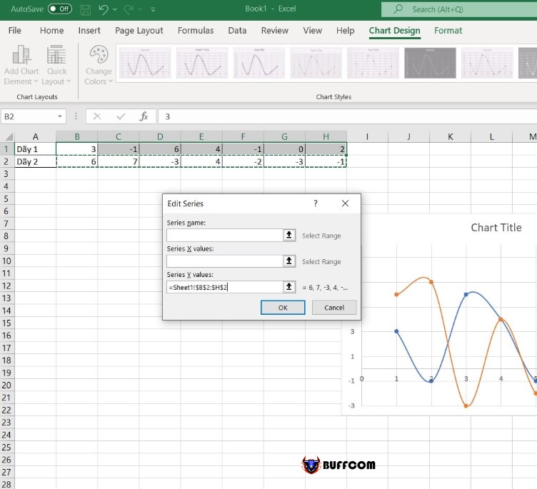
Step 7: In the Series Y value box, select and highlight row 2 of numbers, and then click Ok to complete.
Instructions for Drawing Graphs of Functions in Excel
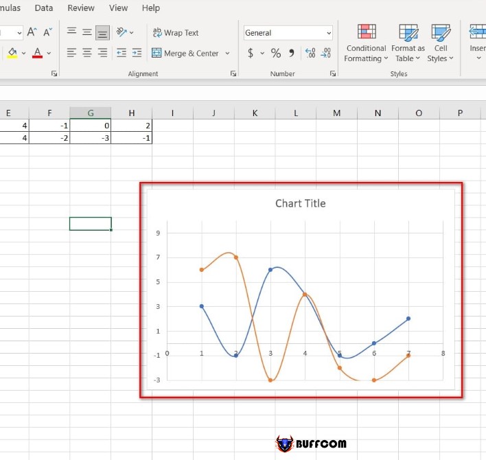
Step 8: The graph after completing the above steps.
Instructions for Drawing Graphs of Functions in Excel
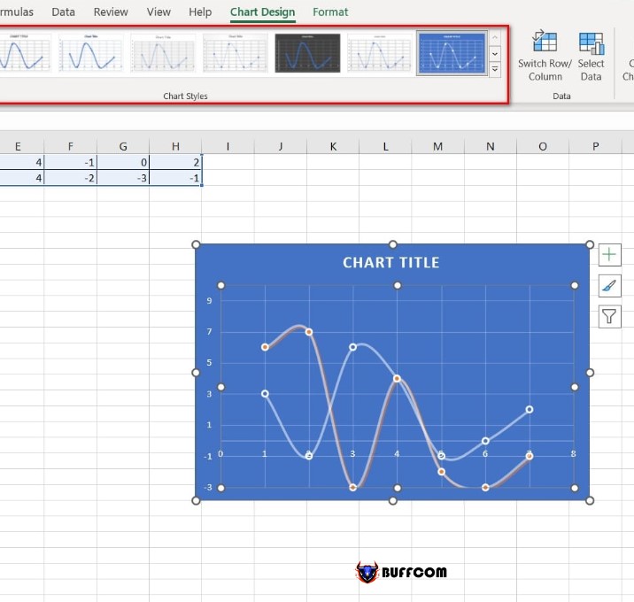
In addition, if you want to change to a different type of graph, you can change it in the Chart Styles group.
Instructions for Drawing Graphs of Functions in Excel
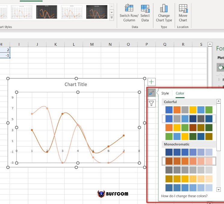
Or if you want to change the color on the graph, select the Chart Styles option on the right side of the chart and select the desired color.
So that’s how to draw a graph of a function in Excel. I hope this article is helpful to you. If you find it useful, please don’t forget to rate the article below to help me out! Best regards.


