Microsoft Excel Dashboard for Industry Statistics
Microsoft Excel Dashboard for Industry Statistics. When it comes to business, analysis plays a crucial role in ensuring success. Analysis helps us understand the profit or loss of a business and determine when and where changes in business strategy are needed. However, relying solely on raw data can make it difficult to grasp the overall picture. That’s where dashboards come in, providing a clear overview of our business.
Let’s consider an example of an industry that sells products through a website. This industry has been operating in various countries since January 2013. The management wants to compare their sales statistics, country-wise and globally, along with their advertising expenses and income. Here’s an excellent example of an industry statistics dashboard in Microsoft Excel.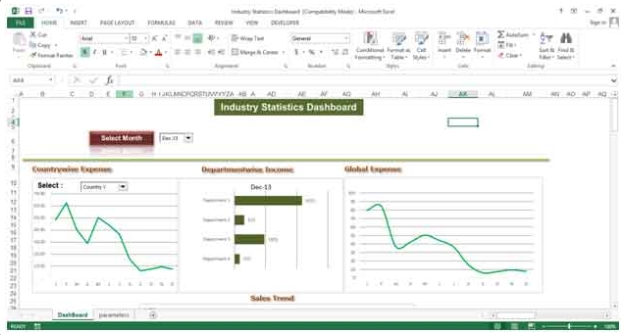
Microsoft Excel Dashboard for Industry Statistics
To use the dashboard, we can select a month from the dropdown list, as shown in the figure. Once a month is selected, the data automatically updates to display the corresponding figures for that month, allowing for easy comparison with the previous month.![]()
The following screenshot shows the trend of costs incurred by the industry in each country. Users can choose a country from the dropdown list to view the specific data.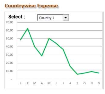
The next screenshot displays the income generated by each department in the industry.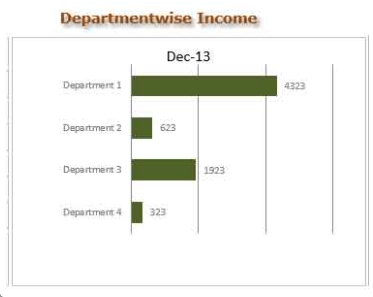
Additionally, there is a screenshot showcasing the monthly costs incurred by the entire industry.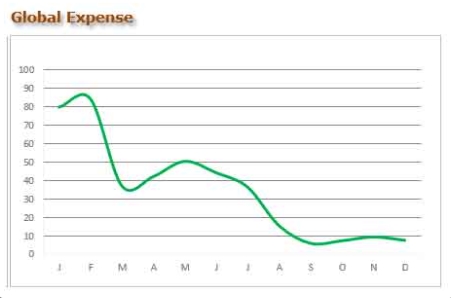
Furthermore, the dashboard includes a sales trend graph, illustrating the sales performance over time.
Lastly, there is a screenshot displaying the percentage income trend for each month.
Overall, this Microsoft Excel dashboard provides a comprehensive view of industry statistics, allowing for effective analysis and decision-making.


