Guide to drawing a horizontal bar chart in Excel
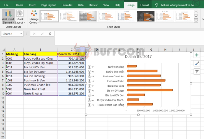
Guide to drawing a horizontal bar chart in Excel: Excel provides users with many types of charts. However, among them, the horizontal bar chart is perhaps the most popular and easiest to use. In this article, Buffcom.net will guide you on how to draw a horizontal bar chart in Excel.
Step 1
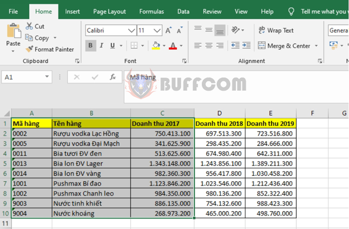
First, you need to open the file containing the data you want to draw a chart for. Then you highlight the data range you want to draw. For example, in this case, if I want to draw a chart showing the 2017 revenue of each item in the table, I will highlight the range from cell A1 to C10.
Guide to drawing a horizontal bar chart in Excel
Step 2
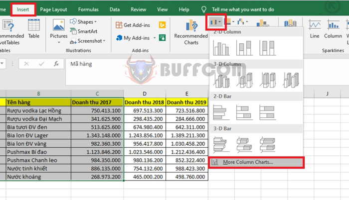
Next, you select the Insert tab on the toolbar. Then you select the Insert Column or Bar Chart icon under the Charts section. A scroll bar appears, and you select the More Column Charts option.
Guide to drawing a horizontal bar chart in Excel
Step 3
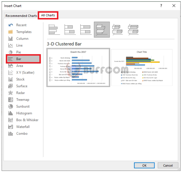
At this point, the Insert Chart window appears. You select the All Charts tab, then select the Bar option. Here, many types of horizontal bar charts will appear for you to choose from. After selecting the desired template, you click on it and then select OK.
Guide to drawing a horizontal bar chart in Excel
Step 4
At this point, the chart showing the 2017 revenue data for each item in the table will appear. You can customize the color, format of the chart at the Chart Styles option in the Design tab on the toolbar.

Guide to drawing a horizontal bar chart in Excel
Thus, the above article has guided you on how to draw a horizontal bar chart in Excel. Hopefully, this article will be useful for you in the process of using Excel. Wish you success!


