How To Draw Charts In Word

Statistical and computational tables in documents are difficult to understand and visualize when there are many data points. The charting tool in Word is a powerful assistant to solve this problem. Word supports many types of charts that are suitable for different data types. In this article, Buffcom.net Science will guide you on how to draw charts in Word 2013. With Word 2007 and Word 2010, you can perform similar operations.
Basic Steps
- Insert → Chart
- Select the chart type
- Enter data table
- Add title and caption
- Change chart color and design
In step 2, when selecting chart types, you need to note the main chart groups and how to use each chart type for the appropriate purpose.
Insert Common Chart Types
The supported chart types apply to Word, Excel, and PowerPoint. You can select them in step 2 and then perform similar steps:
 Common chart types when inserting charts in Word
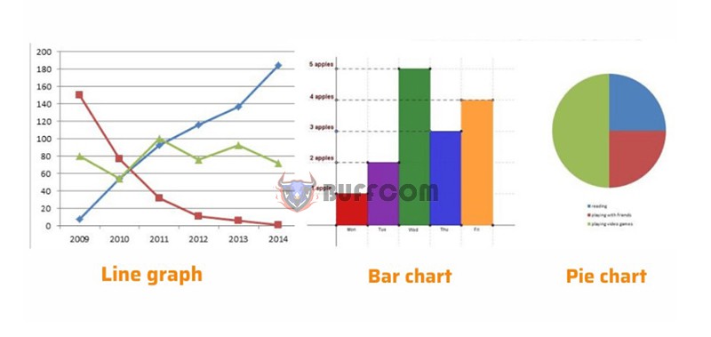
- Column: a vertical column chart that displays changing data over time or compares items. There are different types of Column charts such as 2D column chart, 3D column chart, stacked column chart, and stacked 3D column chart.
- Line: a line chart that can indicate trends over time with marked points at each data value. There are many types of Line charts such as line chart, marked line chart, stacked line chart, and 3D line chart…
- Pie: a circular chart representing data in percentage form.
- Bar: a horizontal column chart, similar to Column but organized vertically and with horizontal values.
- Area: a used to show changes over time and focus attention on the total value over a trend.
Insert Special Chart Types
Special chart types when inserting charts in Word

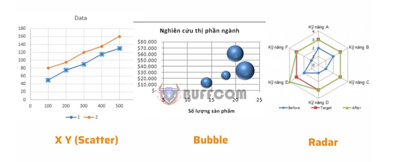
- X Y (Scatter): XY scatter chart, used to compare data values pair by pair.
- Stock: a stock chart, typically used to illustrate fluctuations in stock prices, and can also illustrate fluctuations in other data such as rainfall, temperature, etc…
- Surface: a surface chart helps you optimize the combination of data sets, and color indicates areas that belong to the same value range. You can create a surface chart when both the category and value range are numeric values.
- Doughnut: A donut chart represents the relationship between parts to the whole, and it can include multiple data series.
- Bubble: A bubble chart is a type of XY (scatter) chart, commonly used in market research and financial analysis.
- Radar: A radar chart, also known as a spider chart, displays multivariate data and is often used to determine performance and identify strengths and weaknesses.
So now you have learned how to create charts in Word. If you need a better version of Microsoft Office software, please contact Buffcom.net!


