Using The SPARKLINE Function In Google Sheets

Currently, besides Excel, Google Sheets is also a highly applicable tool. In particular, the SPARKLINE function allows you to create a chart that fits within a Google Sheets cell very quickly, making your data more visual and lively. Let’s explore this interesting feature with Buffcom.net!
Syntax of SPARKLINE Function in Google Sheets
One of the outstanding advantages of the SPARKLINE function in Google Sheets is that you do not need to apply any additional formatting or options. You just need to prepare a set of numerical data in a row or column to create the corresponding chart types.
The syntax of the SPARKLINE function: =SPARKLINE(data)
Where: data is the range of cells containing the data to insert the chart.
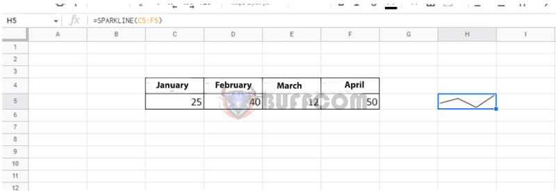
Illustrative example: Based on the data table as shown in the figure, we can visualize the data with a chart as follows:
 How to Use the SPARKLINE Function to Draw Different Chart Types
Although SPARKLINE can only be inserted within a Google Sheets cell, you can still produce many different chart types. In addition to the zigzag lines, we also have bar charts, column charts, and Winloss charts.
Formula: =SPARKLINE(data;{option, choice})
Where:
- data: the range of cells containing the data
- option: options for the SPARKLINE type (we often use the “charttype” option to switch to different chart types)
- choice: the selection for the corresponding option (there are usually popular choices such as bar, column, or winloss)
- Complete formula: =SPARKLINE(data;{“charttype”/”bar/column/winloss”})
For example: With the numerical data table below, we can create many different chart formats as follows:
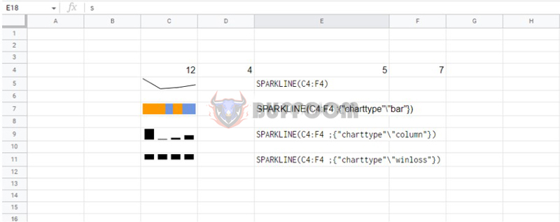 Thus, with a simple formula as shown above, you can create many chart templates for your data set.
Some Formatting Operations for Mini Charts in Google Sheets
In addition to creating mini charts, you can still change the color formats using the SPARKLINE function as follows:
Changing the color for line charts
Formula: =SPARKLINE(data; {“color””red”})
Illustrative example:
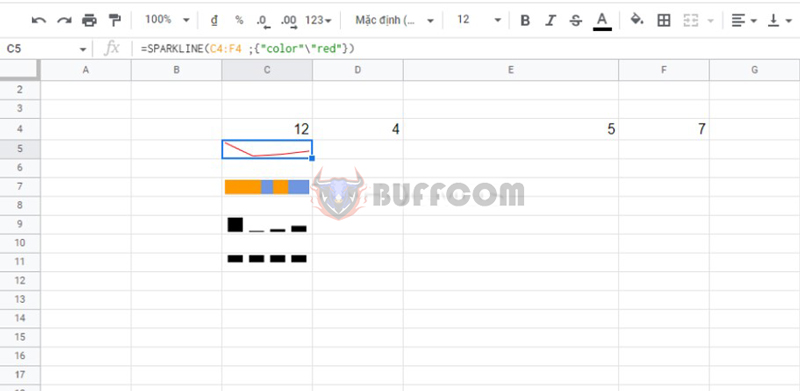 To select different colors, simply change “red” to other color names in English.
Changing the color for column charts
For column or win/loss mini charts, they often have different colors.
Formula: =SPARKLINE(data; {“charttype””column”; “color””red”})
Illustrative example:
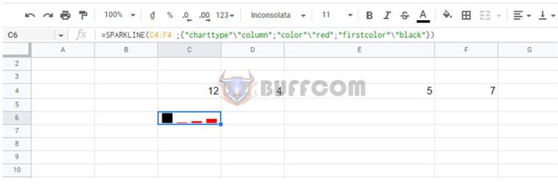 To change the color for the first columns, just change “firstcolor”…
Changing the color for bar charts
Bar charts often have two alternating bars, so you need to use the “color1” and “color2” formats in the formula.
Formula: =SPARKLINE(data; {“charttype””bar”; “color1″”red”; “color2″”orange”})
Illustrative example:
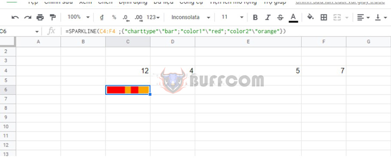 In which, the color columns for “color1” and “color2” can be flexible changed.
Changing Colors for Winloss Chart
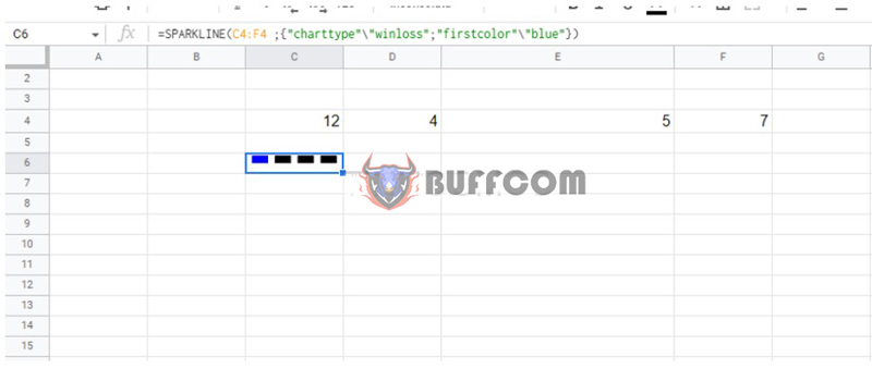
Winloss charts often have multiple color columns, such as “lowcolor” (color for the lowest column), “highcolor” (color for the highest column), “firstcolor” (color for the first column), and “axiscolor” (color for the last column).
Formula: =SPARKLINE(data; {“charttype”\ “winloss”; “firstcolor”\ “blue”})
Example illustration:
 Conclusion on Using SPARKLINE Function in Google Sheets
So, the SPARKLINE function in Google Sheets is really convenient and not too difficult to operate, right? We hope you will have more useful information.
Buffcom.net is currently offering many discounted genuine office software. Contact Buffcom.net to learn more information!


